This month marks the first month of Patreon requests for patrons on my $15+ tiers, so I thought I'd add something extra and use it as a opportunity to demonstrate a bit about how I typically go through my color process. It's really quite simple, and practically the only part of art-making at this point in my life that I've gotten down to a formula.
Images shown above:
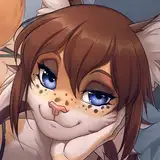
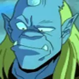
1) Drawing of Impactor with base color, AKA the traditional way of going about a digital drawing
*at this point, I will duplicate the color and line layer and merge the layers to use in the next steps. It's always good to keep a copy of your original layers in case you want to start over and have a checkpoint.
2) My best friend, the Curves tool, under "Adjustments". This tool is available in practically every drawing program, and used to manipulate the values and colors of the image, typically to increase or decrease contrast. It's difficult to explain in words, I would suggest messing around with it to gain a better understanding of how it works.
3) Clicking on the Curves tool will change the layer that you are currently on (Procreate) or create a new layer that changes that acts upon the layers below it (Photoshop/Clip Studio Paint). You can create nodes upon the graph shown, which will be a straight line at first but will become wavy once you start adding more nodes, manipulating said nodes will group together similar value/colors on your artwork and change them as a unit. For myself, this creates a space of pure experimentation where I can go nuts and adjust the colors to my liking until I can create points of high and low contrast in places that are usually out of my control. There will be points where it will look totally crazy! If you keep working at it you might end up with colors you never would have considered before, but they align more closely with the mood and feeling you want to evoke in your head.
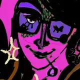
4) Drawing of Impactor post-Curves tool (not the raw layer mind you, I typically eyedrop some colors I like that the tool generated on the canvas and paint-bucket them on to sections of the piece I think will create better movement/harmony. These are concepts that are hard to teach, you more or less gain a feeling of it the more you draw and look at art (but I may try to delve deeper into discussions of it in later guides I wish to make).
5) Finished art of Impactor. On this step I reintroduce black into the piece, as in the Curves step it usually gets washed out (which serves to diminish contrast in the form, making the edges not so harsh and lifelike). Black is powerful, I love using bright colors and black to establish high-key lighting such as in cinema, which draws focus to expressions and dynamic posing. You can use it for drawing focus to basically anything, though.
I do hope to talk more about my approach to color, unity and movement sometime in a more comprehensive format. I think I'm a bit afraid to share my thoughts at times since I've had a few imitators pop up recently that make me sort of uncomfortable to think about. Might be what the kids call a "me" problem, though. I'm happy to answer any and all questions on the matter if you've got them for me. Again, thank you all so much for the support.
Ciao!
Casper