patreon
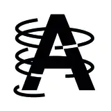
This was my first try at the final logo for The Chosen One is Simply Too Large. I drew the letters over inflated to make them look fat, but the end result had this dated groovy 1970s look that I didn't like
ありすて
nono
fed
nagioka
Aru
Digital Dark Pin-Ups
ririri
sOL
Novus's Fanfiction Works
yunocy
Plantasma Floria
River Visual
Pavlinka14
Time Travel
Twins Comic
SecretHazel
Another Gallery
jyu man
Rain WZQ
madscissor
butazaru-tick
つかさ
SugarJester
JADE
くーもん
sexyoctopus
nv_games
Motherlode
むり
たかし-れろれろ
GmStudios
Terumi
莓兔
VelianthArt
trwnh
Dread
うなパイ
evankale
strode
Luna