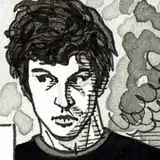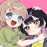
Hi guys, just a fun little update to let you know that I got some prints done of my Angel Crossing piece.
I've never worked with risograph printing before, and I felt it would be perfect for Angel Crossing because the somewhat soft and fuzzy quality would lend itself to the dreamlike effect of the image. I think they came out super well!
I'm not terribly familiar with how riso works, but I understand it's like a mix of a copy machine and screen printing. Colors are printed in layers, allowing for the slight mis-registration that creates a soft and handmade feel. This particular print uses 3 ink colors: black, yellow, and blue. To me it looks pretty similar to the original, though slightly faded. I had my prints done at Paper Press Punch here in Seattle, and they were great to work with!
I ordered 25 of these and hope to sell them at some point. Keep an eye out if you're interested!
Erin Kubo
2020-09-24 00:50:36 +0000 UTCJacob Ford
2020-09-23 22:35:58 +0000 UTCPeg
2020-09-21 19:45:27 +0000 UTC