SakeTami
ShimmeringSword
ShimmeringSword

patreon


Nightsky Concept Sketch

I think someone recently asked to see this one, so here you are in luck!

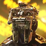
The Nightsky came up on the priority list recently so I hopped on it. Such an appalling visual design haha, but everyone was on the same page about it being a "blow it up" design process.

While there are certainly "iconic" parts of the old design, as a collection they don't work so I had to sift down what could really be taken forward and molded into appealing shapes.
So of course, there's the face. I did my best to keep the teethy look without going outright anthropomorphic.
The arms were a little easier to accommodate. To unify the mounting solution ideas a bit I moved the laser to the underside, while taking its mounting blocks over to the hatchet side. I put in hints of telescoping elements on the arms to help with making the hands usable.
Stepping forward the CT in some way was easy enough to keep, while the side torsos has to settle for some broken up front facing plates rather than a huge turtle shell slab.
Feet and lower legs were also easy to pull some elements from, meanwhile the upper legs are mostly a fresh creation.

All together, I think plenty wont recognize this mech at a glance, but I hope most will be happy to burn the new image into their memory for the Nightsky.

How'd I do?

Nightsky Concept Sketch

Comments

Awesome! I'll look forward to seeinging it!

Bolththrower

It's in the queue to be posted.

Anthony Scroggins

Anthony, any chance to get a 3D render of the Nightsky now that the news that is on its way in the Kell Hounds pack it out?

Bolththrower

Even as someone who really doesn't like melee combat, I am super excited about this one. The hatchet being built around the arm just looks so cool. The bolt on design of the large pulse is also really nice looking. Particularly with smaller mechs, it feels more natural than having them built in.

Ryan de Haas

Cooolthanks for pointing that out Malintus! They look great! Now, the next step...dream for a CityFight Kickstarter with plastic buildings, vehicles and Infantry /swoon!

Don't know about TRO art, but on some of the covers for Shrapnel magazine, you can see updated vehicles, such as the Bulldog on the cover of issue #4 and the Striker and Rommel/Patton on the cover of issue #8. Speaking of which, I haven't picked it up yet, but kudos to the artist for making that last vehicle mentioned recognizable, but I also hate them (not really) for keeping the two tanks indistinguishable still XD

Malintus

I like that there isn't any large plates. The overall look works well. I personally feel like it's a big improvement.

Bruce Faries

I love me a plane cockpit. Also, do you think you boyz are gonna make some updated vehicle art? I can't wait to see a J. Edgar Hovercraft or a Schrek Tank lol

Awesome! Can't wait to see it rendered. The "teeth" and the hatchet arm are the defining traits so I'm glad they were kept. Adding in elements to imply the wrists extend a bit as well and the weapons retract some is pretty cool. I only really have two critiques and one concern. For the concern, I can't tell with this angle but I hope it isn't TOO slim from a front view. Getting rid of the turtle shell silhouette is fine but I still think it should be fairly broad, otherwise it risks looking too much like an Assassin. Of the critiques, the smaller one is me parroting others here in that the hatchet would look better if it was a smidge larger. My bigger problem is I strongly dislike those "blinders" next to the cockpit. I think it would look better with them completely gone and replaced with windows akin to the bubble heads on the Griffin and Battlemaster. Considering its maneuverability and accuracy, I think more visibility would be better to have since I could see it in a recon team of light skirmishers. Also, the mech is supposed to have a full head ejection system and the blinders look like they could cause ejection failures if they were damaged. Just my nitpicks. Still an improvement on the whole and I'm ecstatic to see this one updated. I love my choppy boys. <3

Zera

Hmm, I think it covers the goofyness of the head a bit too much, which was it's defining feature. Alas I'm not the designer. but that is my only niggle about so c'est la vie. Is it on both sides or just one?

James Abbot-Cole

I hope not!

Anthony Scroggins

They are indeed there for a reason... to look cool :D

Anthony Scroggins

Much better than the TRO artwork.

KaiserDunk

Hey boss man: with TRO Dark Age dropping… IndistrialMech redesigns when? ;)

Joe Wright

Good stuff, and it's easy to see how the fluff about the hatched and laser being reversed for left-handed pilots would work.

Mitchell Berthelson

I quite like it. not sure about the bits on the side of the head as they obscure it a bit but I assume they are there for a reason.

James Abbot-Cole

Choppy jumpy boi. Quite the glow up!

Joe Wright


More Creators