If you would like to help us, please look at the images above and then answer the survey below.
Every artist we've worked with on AwBH has done the text slightly differently. Depending on how you read these pages, some chapters may have been harder or easier to read for you, so we'd like to ask for your preference.
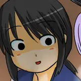
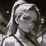
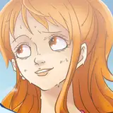
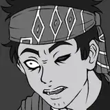
Above, you can see two different options for the Lorem chapter, along with a page of each setting so you can compare what your reading experience has been like in prior chapters compared to the options you can see.
You can access the survey here: https://docs.google.com/forms/d/1r7z4FYnUgdH168PPXDH9fvGGqxZpda2Z83VD6xejkqw/
Andrew Pam
2024-06-04 15:01:34 +0000 UTCVGR
2024-06-04 14:02:43 +0000 UTC