Took me a little while to write more about the process of making this part, cause throwing the files and running away is kinda unfair, since I know there are people who would like to look behind the scenes of creating the story. As I wrote in wattpad author's note:
Part 43 is currently the longest part, ugh I wanted to follow the original plot and not cut out any important scenes. At first I wanted to fit the part in 10 pages, but nope, bad idea, then I extended it to 15 pages maximum, but then it still had missing moments! I didn't want to fit many dialogues in one picture while characters have so many emotions. So, I did my best to draw the scenes exactly as I imagined in my head, all scenes and positions included and even the lighting is exactly the same!
Same as I imagined in my head. Sop for that I started from gathering very random photos from pinterest and google images, looking for warm, soft, tender lighting, with red-yellow tones, color is very important because it sets the mood, the atmosphere, the vibe.

But I'll be honest the exception is only some angles differ and I didn't detail the background, it should have been a classy military office, but then I decided to focus on the scenes between characters only. Other than that everything is just on point, I wanted it to be dramatic, expressive, emotional. Rearranging took so much time.
So I would tell about it in details 👌

The black&white hands in the 2nd picture is my own 2 hands and my friend's hands in 2nd cut, had to pose because finding the right reference for poses is very difficult ><
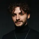
As I said before when it comes to references I don't use the perfect references that look just like art. My approach is the first impression, if it hits, like *snap* and you feel it, then I use it. Even a stock image from getty images can serve as a suitable example lol
Each drawing has separate references for smallest fragments, various body parts, fabric wrinkles... even one portrait can have references for ears, neck, eyes, jaw etc. separately. That's when I want it to be just right 🙌
 4 main stages of my painting process. Seems easy but it takes a huge amount of efforts when you want to improve.
 When sketching, I often make a few versions to see and choose which one is better. For example this pic ^ I had Tae looking sides and looking down. I chose the 2nd one hmm... I didn't study body language and stuff but I can just tell it from my own perspective. So the first version gives impression like Tae is ignoring him, like tilting his head just not to look in his eyes, i felt as if he has this expression>😒 while the 2nd one he probably look down like> 😔 or 🥺 he is defeated, cornered, but also he stands straight like he is listening, all attention to his captain.
Here on the left when he holds a gun too high, it's kinda scary like he pointed it to his head, so 2nd on the right is best version because he's not pointing exactly at himself, he just swings it around like a gesture.
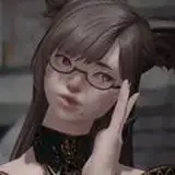
One of the references was a still from MV "Money Game Part 3" by Ren (look at 9:00, OMG I love creative geniuses like him!), the whole performance inspired me to draw Jk's gun scene in sense that he's telling a story and his feelings through a performance like an artist.
 In 1st picture Tae's pose expresses frustration while in 2nd - fear.
Now coming to the most important moment...
 I measure literally everything! Every part of their body, so they are same size, same height. In 2nd frame it was me looking at the finished version in my phone in the night, checking out what needs to be fixed, size, contrast, lights etc. I went a little crazy with this one lol took me 4 days, but it was worth it 🔥❤️
 In my opinion hands express as much emotions as the face does so when face is not vizsible, hands will show it all. In the 2nd frame his hands needed to be more dynamic, like they're wandering, caressing the back of Jk's head, neck, shoulders, while in the 1st one his hands had to express desperation and need.
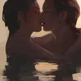
 Some illustrations had just as much versions, as I said light sets the mood, and it also drives attention! Too much light distracts attention from something more important. Like do you notice that? It's like you don't look at the kiss but at the sun spots. Same with details, if there's too much details, it will be a distraction.
I'm trying to find the balance, the perfect harmony, and it's insane how making simple drawings requires much more efforts than drawing something complex on the automatic mode lol I have to analyze every drawing like that, see from the watcher/reader point of view, like what would catch my gaze, accordingly I choose focus. And the focus is the heroes of the story, their passion, their longing, their love 💕
Sorry for my English grammar and typos, I know I make a lot of errors everywhere I type, just writing from my heart without double check, thank you for reading 🫶💜
P.S. I also uploaded color fill & light process in 3 collages like this ↓ just easier for me to share ^^

***
Reminder: Please do not repost/share/reupload my HD art anywhere! Just don't want people to steal my art and use it. I have small version of files, and uploaded a ZIP folder named "Part 43. SMALL IMG. zip" below - that's the versions you can share, with crediting my story and art by ©humanlouvre. Thank you!
humanlouvre
2024-04-18 11:43:40 +0000 UTChumanlouvre
2024-04-18 11:41:19 +0000 UTChumanlouvre
2024-04-18 11:32:15 +0000 UTChumanlouvre
2024-04-18 11:31:47 +0000 UTChumanlouvre
2024-04-18 11:31:32 +0000 UTChumanlouvre
2024-04-18 11:30:23 +0000 UTCNajma Zaidi
2024-04-18 11:28:37 +0000 UTCFred
2024-04-18 09:52:23 +0000 UTCGemmaLou
2024-04-17 23:17:29 +0000 UTCJana
2024-04-17 12:24:25 +0000 UTCZurina Hashim
2024-04-17 11:24:29 +0000 UTCZurina Hashim
2024-04-17 11:23:36 +0000 UTCJGramajo76
2024-04-17 11:03:20 +0000 UTCJo
2024-04-17 10:58:32 +0000 UTCJulia
2024-04-17 10:39:33 +0000 UTCilMar
2024-04-17 10:34:01 +0000 UTC