SakeTami
humanlouvre
humanlouvre

patreon


technical question 2 & moo sketch spoilers

So based on the previous post everyone voted for the original em dash (58% votes), however many in the comments kindly suggested regular font for dialogues and italics for thoughts. And I wondered would it look good? 😯

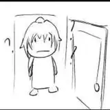
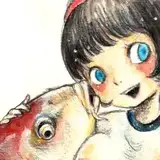
I'm gonna spoiler you with next part sketch preview as an example lol please take a close look at this, which one is readable and understandable as thought vs dialogue?

Personally to me the orginal em dashes kind of ruin the aesthetics of the art but at the same time they highlight the dialogues well 🤔 While I agree regular font is looking nicer, but I only wonder does it show right away that it's a dialogue? I mean I don't want readers to get confused where's the dialogue and where's the thought. Is it contrasting with italic font or not? You can download the image and look at it a few times to see the difference.

this pic in full with regular font if you look closer (oops spoilers 🤫)

vs the dialogue in italic + punctuation

And if we decide to go for regular font as dialogues, now that I think would it be alright to fully change the text layout like that? Switching layout is a big thing to do, but I'm ready to do this if it's looking aesthetically good, does it?

If you don't know which one then you don't have to vote, vote only for the one you like better. Also you can leave your opinion in the comments and I'll check them, let's discuss, cause before I finish this part and update it I want to improve my story overall 💜


technical question 2 & moo sketch spoilers technical question 2 & moo sketch spoilers technical question 2 & moo sketch spoilers

Comments

Thoughts: in italic Dialogue: with dash . Is better in this way

Bele Diaz

Thought in italics. Dialogue in regular font with em dash just like you have it.

jeonjunkie

Thoughts: in italic Dialogue: with dash -> looks good, logical. Not sure about italic for dialogue, though. It looks kinda good, but then there will be too much italic. Plus there should be additional feature (except dash) to highlight difference between speech and thought.

Vesper

Dialogue: regular font with the dash to indicate talking Thoughts: italics (optional) In others, basically what you were already doing.

jeonjunkie

I am more of a reader than a viewer, which is why dialogue is inextricably associated with a dash, characters' thoughts with italics, and plain font with narration.

kotkocur

I hope I don't babble here and what I say sticks to the question you're asking. I voted for the first option, if you do go ahead and change it I think it looks good without the em dash. To have the thoughts in italics and the dialogue in regular font. I would have said don't change but seeing it laid out like that it does to me look good in comparison without the em dashes. It all depends on the reader in a way if they look over the story quickly the difference is quite subtle. Would it be possible to make it bold italics? I do pay attention to detail and really look at the images to take it in (it's my favourite thing I just feel the emotions when I study the images) I think my brain would think about the text and it's difference at first but I feel I'd get used to it rather quickly. There's a difference to me 🙂 I know you'll make it clear on how you let people know of the change. It's a change but if it one you want to make I think it could work.x

GemmaLou

I do think the difference isn't that noticeable, so if it's a lot of effort for you to change it, I would question whether it's worth your time. I've always thought how you did it was just fine, but I appreciate you want to 'perfect' it, but I thought it was pretty perfect anyway :)

sipsix

First love the spoiler. Second I don't see any difference between the texts.. thoughts don't look like they are in italics... but either way I think your original was perfectly readable so feels like a non issue anyway. It's so sweet that you're thinking of your readers though. ♥️

Deni

This is difficult as I appreciate your art as it is, MOO as it is. And I'm already used to read it as it is... so whatever you feel right for your art :)

ASteel

I think the idea of ​​leaving the dialogue in normal font and thoughts in italics to differentiate is good, however, I voted for you to leave it in the original form, as it was already very good before, and I was able to differentiate thoughts and dialogues. Maybe you should take inspiration from professional comics. But whatever you choose, I will support it. I'm looking forward to MOO. 🤩

Thaís

I see no difference lol

Taesbaekookie


More Creators