SakeTami
humanlouvre
humanlouvre

patreon


technical question

Can you guys please help me with something? It's about punctuating the dialogue in My Only One AU story. If there's any English specialists who can give an advice, it would be wonderful.

Alright, as far as I know that in classic writing the dialogues are usually punctuated with quotation marks, however My Only One is a graphic novel, and it's text design is made to resemble movie captions.

In movie caps, the beginning of sentences are usually not punctuated, right? The text just goes because the characters speak on the screen. However MOO is not a movie, lol, it's format is illustrations with captions, and I needed to highlight where are character's thoughts expressed and where is their speech.

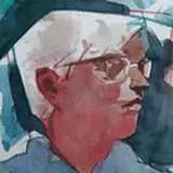
I chose to leave out any punctuation in the beginning of sentence for character's thoughts, like this:

While I picked em dash (β€”) for dialogues because it seemed to me as a readable punctuation mark that highlighted the dialogue. I know that it's not according to English grammar and it kind of pressing on me that it's not correct.

I googled movie caps that include dialogues, and they are often punctuated with hyphen, in rarer cases with punctuation marks, (the latter are mostly used for quotes, following the em dash and name of the author afterwards). 

These movie caps use hyphen (with or without space, I'm not sure which is correct). Anyways it's not all about grammar only, it's about readability and good looking design too.

Why I didn't use hyphen (-) is because in the font I used it looks a bit small and it doesn't highlight the text, or maybe it's just me? That's why I need to know reader's opinion.

I wonder if en dash (–) is fine, or hyphen is more correct? En dash is something in between, shorter than em dash and longer than hyphen, but I don't know if it's actually fine to use it?

Here I made examples that include different punctuation marks. Which one looks better for you? Is it comfortable to read? You can vote in the poll or leave your opinion in the comments πŸ™


technical question

Comments

for the above movie examples, the hyphen is used when there are two voices on screen in that scene, so a hearing impaired viewer knows it's more than one person talking

Bree

I am English speaking and a college grad. There is NO need to change anything. If YOU felt you needed to make a better distinction between dialogue and their inner thoughts, italic font would be an easy fix and it would be readily obvious. Sidenote: Grammatically correct sentences begin with a capital letter (nearly) always. There can be exceptions, depending on the writing style, because nobody is the boss of the author. Just know you are doing an amazing job with your writing. I ❀️ MOO!

jeonjunkie

What you have been doing so far is working great. Please some stress over it. If it’s ever unclear we will ask 😊😊😊

KittyKat801

I think original one is ok πŸ’œ

Barbara

I voted original I have never had any problems and understand it well when a character is speaking in moo. But it's up to you and if you want to be correct it's good for you to ask. It's possible to use a different font like italics to suggest someone is talking. And maybe some sort of key at the beginning to reference this is what it will look like when someone is talking. But like I say Moo always reads really well to me.xx

GemmaLou

In my experience, quotation marks in books and novels seem to be mostly in American/US publications where as translations of books from other countries use em dashes to start a conversation/quotation. For graphic novels, I don't think you need any punctuation since the text is usually under, beneath, or next to the character speaking. I'd be inner thoughts or inner monologues in italics so we know that the person is talking to themselves.

BrooklynShoeBabe (Kisha)

πŸ’œπŸ˜™

Amy Contarino

The way you use it now is fine. As someone who is part of a team who writes legal documents for a living, we just say consistency. Use one and stick with it (whether it's right or wrong, make it look the same). English grammar is evolving, and as we age, those older rules are no longer important. Me? I like italicized text when it's just one character on the screen, talking or thinking to themselves. If there are two or more, em dash and space works as I find it calls it out. Whatever you choose, your work is fabulous, keep going πŸ’œπŸ«°

Trixie Firecracker

Ooh, I love this sort of stuff, and I love that you're thinking so much about it too - that's attention to detail! I think it really doesn't matter - you, as the artist/author, can just pick a styling and stick with it. I think what you are doing is clear, and I'd keep going with that. I agree the hyphen is too small, either the em or en dash is fine, and with or without a space looks fine too. But as what you've done in the past is an em dash without a space, I'd stick with that. Although quotation marks are also 'correct,' I think they look messy. Thank you for caring this much, and thank you for asking - I enjoyed considering the question and the options πŸ˜„πŸ₯°

sipsix

Native Speaker- I think the Grammer matters much less than readability. Most of the graphic novels I've read don't use quotations. The most common technique I've seen is using bold lettering for dialog and italics for narration or inner thoughts. I think (like you said above) as long as it comes across to the reader that's what really matters. You're doing a fantastic job! Thank you for being here and for all your hard work! I hope you take really good care of yourself and eat something yummy today. 😘😘😘

Deni


More Creators