SakeTami
L H
L H

patreon


Sprites Head Rework - Better or Worse?

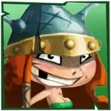
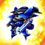
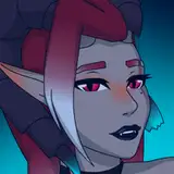
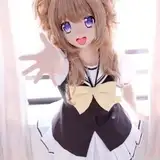
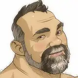
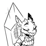
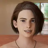
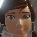
With the increase in the characters amount, I decided it was time to put into practice the change of sprites I was wanting to do.

In summary, I thought the shape of my face was very wide, and I tried to do something cuter. Now they have noses and bigger eye pupils.

🙋‍♂️ It got better? It got worse? What could it improve? Comment here what you think of this change.

Sprites Head Rework - Better or Worse? Sprites Head Rework - Better or Worse?

Comments

I think it's way better now, nice work

Sap82

before is much better imo

Archer

ehhh. what drew me to your game from the start was your art. i like it much more before the change. idk. something about it seems more genuine, if that makes sense? its got soul to it. not a huge fan of the new art. kinda a killer fer me

Wade Wilson

Uuu boy... i can wait to see it... but still looking foward to it :D

DaFirst

Got it! I think you'll like how it's getting then xD I put some small effects of light and shadow in my eyes to give the characters a little more life without changing so much the cartoon feeling, and made the nose ones smoother

L H

Oh, got it! I made some adjustments in the eyes and nose shadows. I think it's getting cool now xD

L H

I definitely find the before version more Chibi like but whatever you choose i will still love and play your game.

Kingalex13547

i tried something but that pretty much removed the feel of your art :D https://imgur.com/a/G2aZMHB It was done is ms paint so dont judge it too harshly please

DaFirst

Id try smaller ears, smaller pupils, less detail on the nose and around the eyes or at least bit thicker lines so it keeps some of its cartoonish style. And eather remove the nose bridge shadow completely or add more softer shadows around the face like under hair and around the eye socket.

DaFirst

After playing around with some free image editing stuff, it seems to mostly be the fault of the shadowing between their eyes.

Jikivol

🤔 Smoother shadows, right? I think you're right. Thank you for your feedback! 💛

L H

😂 Okay... Maybe the eyes didn't get that well 🤣🤣🤣

L H

Thank you for the feedback! 💛 I was looking at them after you said it... 😅 Maybe the big pupil may be making them seem mesmerized, right?

L H

Woow! 😦 Do you found the before version more chibi like? Thank you for giving me your feedback! 💛

L H

Thank you for the feedback! ✌😎✌ I'll try a new sprite for the pupils, a little more like the old one.

L H

You're right. I'll try a mid term between the eye pupils 😁 Thank you for your feedback! 💛

L H

Noses are fine but the shadow doesnt fit unless you add more of it around the face... just makes it look omnious.

DaFirst

If you stumbled into the room and they all looked at you like that i would definitely think they are out to murder me.

DaFirst

I am of the opinion that the changes make the characters feel a lot more soulless. They lose a lot of their cartoonish appeal.

Jikivol

personally I prefer the before look it makes the characters a little more cuter and Chibi like but I'm more than willing to accept the majority vote whatever you feel is best.

Kingalex13547

I'm loving the changes I think giving them noses brings them to life that bit more but in my opinion I prefer the smaller pupils but all the other changes are spot on

Shane

I do feel like it looks somewhat better, but you could reduce the pupil size a little, compared to the previous version, it looks a bit creepy having too little eye white, i feel like the old eye pupils were more cute, but well that's just a personal opinion.

HollowHusk


More Creators