Hoorah! A new brush for Procreate. This time, not for line-work, but for coloring and painting. Before I got into digital art, one of my favorite mediums to use was oil pastel. The main thing I enjoyed about it was how opaque it was, but nonetheless, it was easy to blend. My brush may be digital, but it acts very similar.
HOW TO USE
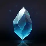
Leave the brush at 100% opacity. All the artworks you find in this post were made entirely using the Koteri Pastel at 100%. Procreate is an interesting tool. It really requires the artist to master a "sensitive touch". What I mean by that is, similar to a real pen, pencil, or in this case pastel, the amount of pressure you apply greatly affects the outcome. No need to adjust pressure curves or any of that. Practice is all you need.
HOW TO PRACTICE WITH THIS BRUSH
When I was enrolled in art class from the age of 6, I moved up very quickly because of one thing. My attention to details, negative space, lighting, form, and focal view. By 8, I was placed in a university art course practicing with university students and adults. I did many oil paintings and my teacher kept on pushing me. What did he make me do to get me to where I am now? Shit ton of studies off photographs. I'd spend 3 to sometimes 6 weeks staring at one photograph, analyzing every minute detail, and applying paint to canvas. That is how details get burned into your mind, making it impossible to forget. Till this day, I apply the same methods.

The image above is a photograph by Alex Webb. What drew me into it was the playful chaos of the children, the awkward framing of nearly all the children which gives it a very authentic "moment of time" look, and the incredible combination of brown, blue, and the pops of red. Below is the study I did of it on Procreate using this brush. With nearly 20 hours of work, what I learned from it was invaluable. I left my own "signature" in the artwork as to not make it a complete copy. I popped some cyan in to add an outline to the dark skin and as a highlight to the skin of the white kid and I upped the saturation of the red to intrigue the eyes. But the forms, the shadows, the negative space between children in relation to one another and the objects, all of those things, I'm doing my best to imitate.
One thing to remember. You do not need to be a great, or even a good artist to be able to copy art well. I've known normal guys who wouldn't even consider themselves artists, but sometimes they'd copy an image and produce something nearly identical to the reference image. What they had was patience and an eagerness to be correct.

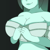
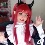
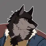
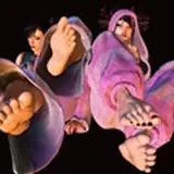
Below are a couple more pieces done using the Koteri Pastel. To show the texture of the pastel on canvas, I enlarge the brush and avoid rendering too much as to not fade away any texture. Then sometimes I make the brush small enough to imitate a pencil crayon to add finer details.


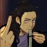
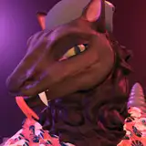
Here's a special image. I was intending on doing KON Volume 1 using this brush. Problem was, each panel took nearly a day. I used to finish a page a week, and so I had to ditch this method after 2 months and only having 8 pages to show for it. Either way, I was happy with what I learned. Have fun, practice hard, and show me what you make!

William Dorion
2021-04-27 21:37:52 +0000 UTCMKFreigeist
2021-04-15 12:13:53 +0000 UTCReggie
2021-03-22 18:14:27 +0000 UTCDavid Tenorio
2021-03-22 15:49:31 +0000 UTC