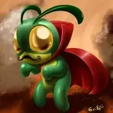
What's up everyone, check out this new TUTORIAL video 🙌
While talking a bit about my process, this one goes deeper into how and why I pick the colors I do, and why they work. In the future, I'd like to make a vid covering purely color theory, but this one aims to give context with how it ties into my specific workflow. This way, the intention is to give you guys more actionable steps that you can copy and apply in your own paintings.
Below, I've also attached the PSD file for you to dissect and look through.
Let me know what you think 🙏
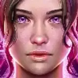
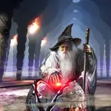
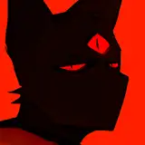
Value- The lightness or darkness of a color, used to create contrast, depth, and form.
Temperature- The perceived warmth or coolness of a color when compared with an adjacent color.
Structure- The arrangement or organization of parts within a whole, designed to provide stability, order, and function.
Local Color- The true color of an object in neutral lighting, unaffected by shadows, highlights, or reflections; it’s the object's base color.
Ambient Light- The soft, indirect lighting that fills a scene from all directions, reducing harsh contrasts and illuminating/colorizing shadows.
Occlusion Shadow- Deep, dark shadows where surfaces meet or overlap, blocking light entirely and adding depth and realism.
Reflected Light- Light that bounces off surrounding surfaces onto an object, subtly affecting its color and/or value.
Nick Star
2024-12-18 14:52:40 +0000 UTCLeonardo Peñaranda
2024-11-07 09:47:26 +0000 UTC