Little Update 03.11.2017
Added 2017-11-03 10:30:30 +0000 UTC
Hey peeps,
hows it rolling?
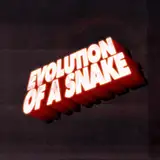
Going fine here, making process. Just a quick little update, we have spent a bit more time on the logo/banner, check this new WIP out :)
Stay tuned, stay merry,
-Wild Life Team
have you tried green? I think the blue gets lost with the black background and red is overused but because its a good color with black it stands out more.
deez nutz
2017-11-06 00:51:00 +0000 UTC
Love~
1
2017-11-05 12:54:27 +0000 UTC
On a black backdrop, both look great. I like the logo, but if both had a backdrop of the sand dunes or of a lush jungle, the red would be my preference.
Repeatmetic
2017-11-05 05:57:03 +0000 UTC
Looks nice. You can also combine the arguments from others here and just combine the two colors making it purple...your call.
Hentai Nerd!!!
2017-11-04 01:58:37 +0000 UTC
You already have blue tones through the reflection effect on text so I would make the underlining graphic use a brown, then as alternative you could place it on top of parchment paper that has a a tan or near yellow color and make the underlined graphic have a green color.
Wesley Gunder
2017-11-03 22:41:05 +0000 UTC
I don't think either color really fits the game. Something more natural like green or brown would look better.
HomemadeMask
2017-11-03 17:59:13 +0000 UTC
Red logos are overused? There are far more blue logos then red ones. I would like to see how it looks with a colour between orange and brown.
Endirazu
2017-11-03 16:21:51 +0000 UTC
I like blue better, but something about looking at the logo makes me feel chilly, and the thought of being naked suddenly seems less appealing when I have an impression of cold and frost. The red logo feels hot and sultry, so I think it probably does a better job evoking the appropriate feeling for me. My two cents.
Kedokata
2017-11-03 16:20:20 +0000 UTC
Great logos, red logo rules)))
2017-11-03 14:16:08 +0000 UTC
Red is overused, plus Blue is more calming a color and so far this game seems pretty chilled out overall. Maybe that might change at some point but I think for now for sure, Blue fits best and is not as commonly used
Renmaru
2017-11-03 14:13:43 +0000 UTC
I also think that blue looks much better than red!
(✪㉨✪)
SexBook _____ ADULT PHOTO AND VIDEO SIGNATURES
2017-11-03 14:01:40 +0000 UTC
Blue looks amazing.
PsychoDelusional
2017-11-03 13:21:04 +0000 UTC
Blue for sure it's nice the red it's too much of a color a lot of games took it already so it begins to be old but blue now is the best :)
CassyIncestStory
2017-11-03 13:14:59 +0000 UTC
Blue looks the best! But the art and font looks amazing!
Samus101
2017-11-03 12:46:41 +0000 UTC
yeah, the blue is great!
Granata
2017-11-03 12:18:53 +0000 UTC
The blue just looks better. The red has a dissonance so improper it even hurts the eyes. The game doesn't use rich color, or high contrast, strong cellshading or sharp edges, or anything that would warrant a logo that has an element so balantly standing out.
Little Oni
2017-11-03 12:06:38 +0000 UTC
hm i don't know, i think the red looks better, but i agree, that it might look more like other logo's with the red.
I would actually like to see it in either brown or green. Since it's "Wild Life" wouldnt green fit better? And its all going down in a desert map atm, so maybe brown aswell? xD just my thought.
EutCake
2017-11-03 11:01:21 +0000 UTC
Nice work
2017-11-03 10:54:06 +0000 UTC
yea agree with SpookyTre the blue is something Different
LolWhattfBBQ
2017-11-03 10:52:10 +0000 UTC
I like the blue! It’s different from the usually red logo you see now and days.
SpookyTre
2017-11-03 10:35:37 +0000 UTC