Hello fellow investors of DSG,
A big question you guys have always been asking is "When do we get merch?" and before we can start heavily looking into merch - we first have to nail down our rebrand colors - BECAUSE if your logo is a certain color, a lot of your apparel will kinda revolve around those colors.
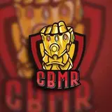
Since DSG builds off the Disguised Toast brand - which has been traditionally in the yellow x black color palette, naturally we want to lean into it a little.
UNFORTUNATELY - black and yellow is one of the ugliest color combos around if its not done right. Most times it is just too contrasty - which is why so much warning signs or traffic danger posts are colored Yellow and Black. Same with the BEE, nature made them black and yellow for a reason - because it catches your attention.
It has been attempted many times by esports teams - Dignitas being the big one in NA that goes hard on the bright yellow, as wells the Pittsburgh Knights from the Valorant scene. I wouldn't say I'm a big fan of either. Over in Asia we see both GenG and RNG try a very muted brown/gold to give it a more classy look but it becomes a little too tame in my opinion.
Here are some of the possible palettes proposed to us by the creative agency we're working with!
Curious as to what you all think!
- Toast
Tomodachi
2023-07-28 05:10:03 +0000 UTCNerflix
2023-07-11 07:18:57 +0000 UTCBurpski
2023-07-01 21:53:48 +0000 UTCandreggvil
2023-07-01 07:52:49 +0000 UTCBenjamin Schunck
2023-06-29 12:37:17 +0000 UTCMRBrightside
2023-06-29 11:58:53 +0000 UTCCesar
2023-06-27 21:51:27 +0000 UTC