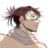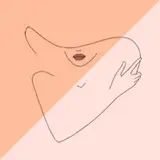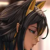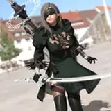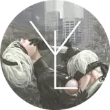
So, been working on this again and I felt the composition didn't really deliver the energy of the piece well enough and that tilting the angle a little would help tremendously (also a bit of a zoom to focus more on them).
Your thoughts?
*Top is original composition. Bottom is tilted angle ver.