Business Card Process
Added 2025-11-08 02:15:08 +0000 UTCYumi had suggested the idea of making a new business card mimicking the layout of Instagram, making it look like a "post" with a fitting picture, something that would make you think yeah it's something that was taken while Krea was out with someone. I liked it so that's how things started!

Out of the 3 initial sketches, there very obviously was a winner lol, the only one that went past the rough draft phase. Pretty straightforward from here on, refine the sketch and print it out to ink.
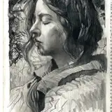
 Digital clean sketch
 Inking with light pad.
 Inked work!
The layout of the place is vaguely based on Komeda's Coffee, a Japanese chain that I really enjoyed in my stay, I miss it so lol!!!! The pastry is called shiro-noir, its cute and tasty, I think Krea would eat it.
I was gonna draw her eating a parfait, but I didn't want to look through pictures to see which one I liked lol, so instead I just grabbed a photo from another cafe Yumi had gone to. It's nice to reference our lives in tiny ways like this.

The goal for this drawing was to exclusively work using Copic markers. No watercolors, no color pencils, just ink and markers.
I was much more cautious with my approach compared to previous times I've used them. Like with the Taifau Cafe cover, I colored over the printed sketch to have a feel for the colors. I took my time to make sure I knew what I was doing lol, I think I learned that a big part of using markers well is that you need a lot of layering. Before I would just use the color that I wanted, for example on Krea's hair I would just grab the marker that most closely resembled it, but usually it would be too dark or harsh, but this time I went with lighter tones and slowly layered them on top of each other to get much nicer tones.

It was a lot of "I don't know what I'm doing hope it works lol", and thankfully it did work. Like I said there's a lot of layering, at the start everything had this yellowish tone, to keep the warmth of the scene that I wanted to convey, also for the sake of consistency with everything else.

Overtime I started adding darker and contrasting tones, there was a little bit of it already with the pinks/purples on her cardigan, but the shadows are more prominent now.

It was towards the very end where I pushed for more contrast, most evident in the sofa where I started using blues for the darkest shadows, same for her little beret. Due to the green of the (toxic) melon soda, I also sprinkled around some light green around the table and other light areas once again, to make the whole piece more cohesive.
Final tweaks were added with a white pen I had, most noticeable on the soda, but also general highlights, on Krea's hair, eyes, the dishes, etc. Minor things to make it all pop!
 She worked very hard!
And that's the jist of it! For being my first serious attempt at a complete piece with Copics I was pleasantly surprised at how well it turned out. I definitely want to do more and its encouraging to see that I can actually sort of make them work after all. I love watercolors but it really is a pain to keep waiting for the damn paper to dry!!!! lol, so markers have been the ideal tool I had been looking for.
Hope this was nice to read!!!!