
Weekly Report (June. 19th 2016)
Added 2016-06-19 11:18:53 +0000 UTCHello everyone! Weekly report is back.
First of all thank you for the messages, I'm 100% fine now. Geez, it took me straight a week to get recover from summer flu. X_X; anyway, here's the stuff I've been working this week.
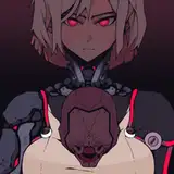
1. additional H animation for the armored bull :


I hope you like it :P
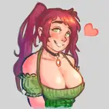
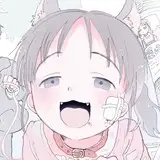
2. Some random pixel source for the sequel :


Cup noodle :P
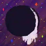
3. Title screen remake plan :
Following images are not applied in game yet.
these are just example for the new title screen.

Example 1. simple background with falling petals. well, simple is best right?

Example 2. Market thumbnail + example 1.
personally I prefer this one, but I'm kinda afraid that people might get frustrated at the opening cut scene X_X;
also I need to ask to Fenrir first if I apply this way.
4. Oh yeah, I must let you know :
The floral mine now has a new skill that can turn into nearly invisible.
not completely invisible, but it'll hard to find him.
so now the player must be very careful since they are not very noticeable now. lol
5. Still struggling with vore scene :
I have mouth but got nothing to say. I'm sorry everyone.
I feel ashamed to myself ugh...
but don't worry...I'll figure out some how. ; _ ;)
6. about HCG remake progress :
So far, there's not much I can say, He's working hard.
and we have only one HCG left until the demo release. :P
so that would be all for this weekend. I hope you enjoyed it.
Ah, actually there's more to show you.
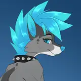
It's not related with project- but just for fun :P
Have a great weekend everyone, I'll keep update this posed as soon as I make a progress of the vore H animation.
Comments
Yeah, the second example is neat. I'm not concerned about "style clashing". I don't think this game suffers anything wrong because the intro screen has high quality picture, then the game-play is pixel art. Pixel art can be sexy in its own right just as the second example. Hell, sometimes it could be more detailed, but it's about context. I think quality translates well in this game and I don't believe in removing one over the other, or worrying about which is best. I think both are fine, but ultimately adding the second example simply because it fills empty space and it has interesting detail with the torn clothes. The first one is nice for a quiet and thematic menu. Por que no los dos? Also, why remove the blurred petals from the first example? Was there something wrong with them?
Robert-Alexandru Deleanu
2016-06-21 05:49:16 +0000 UTCThank you. I wanted to prove the everyone's support was worth it. and that's one of the reason why I decide to remake the HCGs. haha
Sourjelly
2016-06-20 03:27:32 +0000 UTCありがとうございます。その後も意見があればお気軽にお申し付けください!
Sourjelly
2016-06-20 02:57:23 +0000 UTCYeah, I love classic way too. sad thing is I gotta pick one anyway X3
Sourjelly
2016-06-20 02:52:33 +0000 UTCHmm... that's a good idea. I'll keep that in mind.
Sourjelly
2016-06-20 02:50:23 +0000 UTCExample 2 looks good and the art styles wouldnt clash that much, but I'm mostly just saying that becuase the amount of work and effort being put into this project is just surreal.
Mia Amyton
2016-06-19 15:21:20 +0000 UTC追加アニメーション、本当に素晴らしいです!我がままを聞いていただき本当にありがとうございます!ぜひこれからもずっと応援させてください!
PEACE
2016-06-19 14:06:10 +0000 UTCSo you're worried about people being confused by the art style difference? It should be a problem, you can list on dlsite that the CG artist is Fenrir and pixel Art is Sourjelly~
2016-06-19 12:40:28 +0000 UTCI prefer example 1 , simple and classic ( • ̀ω•́ )
Sicktan
2016-06-19 11:50:04 +0000 UTCYou know, when you start the New game, it tells you the background story with pixels cut scenes.
Sourjelly
2016-06-19 11:40:46 +0000 UTC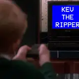


