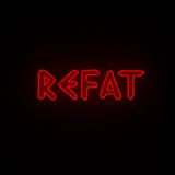
It feels like the smooth drop shadow clashes with the hand drawn font and background.
Maybe just try using another brush texture for the font, like red crayon or chalk. That will do a good job distinguishing the text from the background if you so desire.
Kex
2017-02-02 03:24:11 +0000 UTC
Like this color over the previous one. Dig the font, but the super thin lines on the K and the E are still kinda tough though.