Finding a 'look' for the flow was a fun challenge.
I went through several designs on some of the key characters. Above is an early variation of Zephyr with a 'funny' alternate to Skyfire. After all, it is a jet that transforms into a fighter... where DOES the nose of the jet go? Sticking out the chest is kinda hilarious.
As for Zephyr, I think that look is super hot. As a genderfluid species, I think 'female mode' pocam might be really hot.
I definitely thought a lot about narratively depicting a sexual foursome of Kai, Eliza, Zephyr, and Zen... but a few of those beats felt odd, particularly Eliza, and Kai usually felt too vulnerable for it to 'make sense' narratively to commit. Maybe something to explore in a sequel? (Curious if there ends up being interest in a sequel to 'the flow').
Just to indicate how much range there can be in the early brainstorming phase, the below is also Zephyr and Skyfire

I do definitely wonder if maybe I should go back and edit, even, to make Skyfire more of a 'pocam' mech, feeling more alien, more psionic or with different alloys? The main issue with editing something like that in at this point tho is that it'd just be 'dressing' and wouldn't have a narrative payoff later. Still, sometimes 'cool for the sake of cool' isn't a bad idea, although I do like the design of Zephyr and Skyfire I used in the dramatis personae.
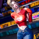
 Eliza also went through a few iterations. To be honest, I think this was my favorite background with Hydroponics. Honestly I do still quite like this look for Eliza.

Eliza on the beach also could have been more 'classically anime'.
 Li is another character that I struggled to settle on a look for. This is one of the earliest ones, and to be honest, this hairstyle probably is the most 'realistic.' Obviously I reworked the look of Phantom Strike after this point.
 Other than the sniper rifle not making sense, I was relatively okay with this version of Li. The 'down' look is basically fine, even if it's less 'military/scifi' realistic. The problem was making sure that Li's silhouette would be consistent enough when she was suspended in pods for certain parts of the story.
 Talking about major redesigns, while I was in early brainstorming at one point I ran into the questions of the baseline traits of the pocam. For instance -- should the pocam have hair?
One appeal of the above design was that the pocam are a people with a closer connection to 'energy' than humans. So having glowing hair, hair that might react even faster than their skin tone to their feelings, might have been a cool effect.
But it's funny, sometimes you don't know what a new design is until you say 'no' to something. At some point, I was just like, 'no, the pocam don't have hair.' And to be honest, I don't think the pocam as a people gelled until that rather silly and frankly arbitrary decision.

Even then, I played with a few more options on how I might still visually conveyed their 'energy connection.' The more I played with options though, eventually I decided to go with a less 'glowy' option.


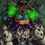
One of the later phase redesigns was the Gen-Forger Bulwark Beast. The above are two iterations -- the first of which is one I went with for the first chapter preview update -- that I later adjusted.
The challenge with the Bulwark Beast for me is in part a question of bookending, since the Bulwark Beast is the closest to one of the enemies faced toward the end of the novel. So I wanted to make sure that the 'coherence' of the types of challenges the gen-forgers presented had a kind of internal logic, which also played into them being 'bio-mechanical' rather than just biological. Adding the 'exhausts' was one of the key ideas here, since I think that makes the Bulwark much more distinctive as a large enemy than the initial design.
Anyway, creating the world of the flow was one of the first times I ever tried to 'really' make a space opera setting, and hopefully this gives some insight into the fun of that process!