Bubbly commentary, part 2!!
Added 2025-05-31 00:07:58 +0000 UTCSO for the second part of commentary on this piece I’d like to focus on an AMAZINGLY important piece of technique anyone can apply to ensure their drawings come up more colorful!!! Its probably one of the most important things I do with my drawings.
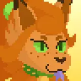
If you’ve worked with coloring before, you’d probably look at the end result of Bubbly and wonder “why did he choose yellow for the floatie?” (Its not because the base had it in the base I promise 😅)
Honestly at first I was gonna change it to blue or pink in fact! BUT after several test colors I realized yellow might be the best call with Skook’s (the otter) colors to ensure his pink and light green markings popped

Some combos DID come pretty close, but in the end we opted for yellow! But that raised a new issue.:
“How to make a yellow character STAND OUT from a yellow floatie?”
The key and the most important aspect of coloring: focus on value!!
Value in coloring refers to the lightness or darkness of colors (basically how bright they are) and actually does 90% of the heavy lifting ensuring a piece’s colors look harmonious. It also ensures colors stand from one another! So its important to keep track of it as you color a piece.
An EXTREMELY easy way to do this is to add a black and white filter to the topmost layer in a digital drawing! (But taking black and white pics works for traditional artworks!)
I usually keep a pure black layer on the top and set it to a “hue” or “color” blending mode so I can turn it off and on at will. It allows me to keep track of which color choices might work best

And thats how you can ensure your colors look balanced consistently with low effort!! It also helps A LOT in adding volume to a piece, so if you’re ever in doubt an unconventional color mixture works, try testing it out this way!

Comments
I'm not an artist, but for publishing scientific graphs or figures, if they use color we also look at them in black and white to make sure they are readable for colorblind people or in print. It is cool to learn that a similar thing can help in art as well!
Zinn
2025-06-01 00:44:58 +0000 UTC