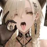
Today I am pleased to finally present the first full color splash image from the Martian of the Month series. "Waiting for Pick-up" is the menu splash image for the game at the moment, and is the first of several splash images planned for the game. The image also offers a great chance to explore the world and get to know the inhabitants a little better. The main goal of the image was to create something that invites the viewer in, and makes them want to play it. (Which I hope is working!)

The process of making the image felt like a DISASTER. (I describe the whole process below) I had a brilliant plan for finishing the image FAST, in a single morning, through sheer force of will and indomitable spirit, ...but instead ended up pulling my hair out and weeping over my Wacom tablet. My easy-morning-walk-in-the-park victory turned into me working to 4AM just to try and salvage the image.

In spite of the mess I went through making the image, I am really pleased with it. I loved the change of scenery and getting to work with these strange new characters, and getting to use effects that I haven't really been able to play with in the more medieval fantasy I normally work with.
So... what caused all the pain and made this painting more of a struggle than it needed to be?

The image began as the usual rough sketches establishing the composition, the layout, and the character poses before moving on to a more detailed drawing.

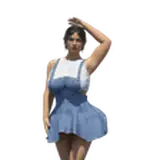
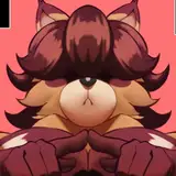
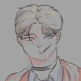
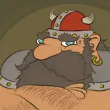
After sketching out my rough ideas I tried a few different characters for the main one. The game is very "pest-centric," and is largely a cathartic attempt to reconcile myself with the sheer volume of pests I have had to hunt down and kill since becoming a home owner. Ultimately, we went with #4 as it was fun, but also left the character just vague enough to be easily changeable later if we decide to move away from using anthropomorphic figures as playable characters.
Before diving in, I did a quick color-comp:

Then, I started painting:

In the Process Guide, you can see that we more or less stuck to our usual method of illustration. The only difference is that I started with a fairly clean digital drawing, and I REEEALLY tried to hang on to that digital drawing. My thought was to have a bit more of a comic look, and save time by using stronger outlines instead of heavily rendering all the shapes.
I tried and tried, but somewhere between frames 5 and 6, I lost my mind. I had executed my plan, and had gotten to the place I wanted to be in just a morning of work, but I just hated it. There was no getting around it. I had to either scrap the painting or push on to finish it!

Good, Bad, or Ugly? The above frame shows the target look. But I just wasn't satisfied with it. What do you think? Is the comic look good enough, or do you prefer the painted look of the final image?
The last 2 frames of the process guide add SO little to the overall narrative or emotional effect of the image, yet they took me 3 whole days to finish! 2 steps that took 3 days! It feels bad, but those last frames are often what separates mediocre from excellent. They show the artist's dedication to the idea and how much they are willing to suffer for it, (demonstrated through their willingness to add further and further detail). And now that I am here, I can't image the image without it. (I hope that is encouraging for someone out there. Even when you are noodling away at details for hours and hours and hours. It does pay off.)

But what do you think? Was it worth it?
Either way, I hope you've enjoyed this one! Can't wait to see this thing in action!
Justin Gerard
2022-12-15 13:26:43 +0000 UTCIsabelle Algrin
2022-12-15 00:31:03 +0000 UTC