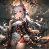
[making process] Fujiyama sankaku Blue Archive Sexy seia de sumanai...Process & tips2
Added 2024-06-30 04:50:32 +0000 UTC
In the previous article, I mainly summarised the surface treatment and axing, so the next step is colouring.
Recently I have been making colouring specifications in advance, so I am doing the same this time.
In the same way again, I made eye-decal style data and actually drew it on the parts while getting an image of eye painting.
As always, I will not discuss the process of removing mould release agent. To remove the mould release agent, I just soak it in a solvent and wait for 10 minutes.
*Beginners should never imitate this.
An easy and safe way to remove mould release agent is to soak it in hot water and polish it with a mild detergent and cleanser. You can use a toothbrush.
Other methods should be considered after you have some familiarity with making GKs.
Also omitted here is the fact that a clear coat is required for each step of the process for eye paint, although this is also always the case.
I have also told you many times in the past why skin colour is applied after eye paint, so if you are interested, please read the past articles.
Production process 3 - Colouring materials and detail painting methods
┃Colouring materials and results
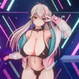
This is the colouring material, but I made it like this.

This is the result of painting with reference to the material above. I stopped using gold for the highlights in the hair and used semi-gloss and gloss to give a glossy look.
The back of the hands and the back of the feet glove parts are painted with a stronger skin colour transparency.

The main colour of the hair, tail and ears is yellow, but it is easier to create a beautiful gradient by mixing brown, red and orange into the base colour to create a neutral or shadow colour. It is important to mix several colours in white surfacer to create a base colour.

The base colour is this colour. If you apply too many shadows or highlights and get a strange colour, you can just apply this base colour and come right back to it, so you can work more efficiently.
In addition, the shadow colour can be made in the same way and then simply layered on top of it. It's that easy.
 The base colour can then be applied on top of this to adjust the colour, while a diluted white is used to create highlights. I think it works best if you create an extreme gradation once and then apply the intermediate colour to balance it out.
The final adjusted hair colour looks like this.
 If you paint it with the image of a low-saturation yellow, you can prevent it from turning bright yellow like a bottle of raw... maybe?
The vines for the hair ornaments are brownish, but a little duller and less saturated. It's like mixing green, brown, black and white.
 Brush painting with enamel paint is a good idea as it does not require masking.
I adjusted the colours to suit the atmosphere, as neither too dark nor too light would suit the image.
 The tie, the ribbon at the waist and the upper part of the knee-socks are navy, but the colour is also slightly desaturated. The yellow line on the tights can be the same colour as the hair colour; if anything else is used, it will stand out and look odd and uncomfortable.
The pattern is hand-drawn. There are no decals.
 The pattern in the tie section is also well drawn, but almost invisible.
 The skin colour is based on COOL UNDERTONE, with a thin base coat of Modelkasten C-12, followed by an overcoat of a much diluted fluorescent red. Add orange as this is the only reddish and white colour of the resin. The skin colour was created with a thin overcoat of Gaia 059,060 mix paint.

 When overcoating with orange paint, the paint must be applied thinly or it will move away from the cool undertone, so keep an eye on it and make sure that the overall skin tone density does not become too dense.
The axilla, groin and belly button areas are in valleys, so the paint will not go in with an airbrush. Apply a thin coat of enamel mucous membrane clear to these areas with a brush.
 Mixing with enamel clear makes it easier to apply.
 It is like working in the same way wherever there is a valley. (Although the buttocks don't have to be painted as they are hidden by the tail)

Also apply between the fingers.
 Painting the valleys will make the final product less white and noticeable, so it is a small step to take, but it improves the finished product.


For swimming costumes and knee socks, apply white, then shadow (pale blue), add skin transparency and then overcoat again with diluted white to blend.
The yellow lines on the knee-socks can be painted without discomfort by using enamel paint toned to the same colour as the hair and tail.
The grooves in the lines are shallow, so it is not possible to paint and wipe off the enamel without masking. Masking is required for all of them.
 The knee part is very undulating and will float if only masking tape is used. So the floating parts are cut with scissors and liquid masking is used at the joints.
 Masking takes more time than you think, so we recommend working when you have enough time.
Overall, the parts are simple and the painting itself looks easy, but it takes a lot of work if you want to apply gradations and paint separations well, so it is surprisingly hard work.
It is better to use a single colour of clear white for the sleeves of clear parts.
 Be careful not to apply too much to preserve the transparency of the sleeves. Clear white is a pale colour when used for clear resin, but becomes white when matte-coated.
Also, the hair and tail are partially painted with a thin layer of semi-gloss coat and gloss coat after the matte coat to give the hair cuticle look.
 The same gloss adjustment was made to the back of the hair as well as the front.
 A recent trend is to use a slightly shiny technique for the hair rather than a full matte coating. The cool undertone of skin tones is also a trend, and it is easy to get in on the bandwagon by actively adopting the painting methods used in PVC figure examples.
Here is the final gloss adjustment result
 I tried painting Halo with clear white and fluorescent colours, but it was difficult to express the whiteness of the original illustration. If you think you can do it, please give it a try.
By the way, I used a completely white background paper (although it is grey due to the lighting) to check the painting. Coloured or black background paper is used for atmosphere, but if white is not used for confirmation, the background colours tend to mix and become unclear.
We have also uploaded a photo of the white background paper we sent you for confirmation, so please feel free to look at it and see what it looks like.
┃Eye colouring data and results
This is data that I made for myself. The size is also made in a very random way, so it will not fit the hollows of the eyes when printed out. This is practice data to get an image.

Of course, it is not possible to do eye painting like this... and even if you can do it on the data, it is impossible to reflect it in actual hand-drawing due to various restrictions, so it is just for reference.
Here is what I actually drew.
 Details such as eyelash highlights and under eye highlight edges are omitted.
 The soft edges of the eyebrows are just a thin layer of brow colour on the vermilion part of the draft.
Once the draft is made to look darker in vermilion like this.

Simply apply diluted brow colour and wipe off any overflow. This is recommended as it easily creates a softer look and makes the edges of the eyebrows easier to see and blend in.
 The reason why this step is necessary is that yellow eyebrows can look like they have no eyebrows because the colour of the yellow eyebrows blends in with the skin colour, making it difficult to see the border between the two. This method is recommended because it is more efficient than applying another colour afterwards and also because it is easier to blend in.
Incidentally, the diagonal lines on the cheeks were drawn in fluorescent red. Solid red is too dark and clear red is too thin, so I used fluorescent red to keep just the right balance.
┃Countermeasure against nose reddening (localised colour darkening) when painting the skin tone of the face
This is a problem that occurs when you get used to painting to some extent, but sometimes only the colour of the nose becomes darker when you are painting skin tones. This problem is more likely to occur when fluorescent colours are used.
 This is exactly what happened. The area around the nose is red.
The reason for this is that the airbrush is moving from all directions, from the outside of the part towards the inside (centre). The end point of the trajectory is the centre, i.e. the nose, so in a sense it is natural. And fluorescent colours tend to be like this because they stand out from the surrounding colours because of their high colour rendering.
Therefore, measures such as stopping the paint spraying before it reaches the centre, or moving the hand to the edge instead of stopping at the centre, are effective. However, if the colour of the nose becomes too dark even if I am aware of it, I dilute skin-coloured surfacer and carefully apply a thin coat to match the surrounding area. If you can make a similar colour with enamel without using a skin-coloured surfacer, you can also use that.
This method can also be used for other situations where the colour of the nose has rubbed off (the resin base is now visible). This is a slightly more difficult repair method, but the good thing is that if you get it right, you won't need to repaint.
If you can blend it in well, it will become less noticeable, so try it if you can't help it.
 ┃What we think about metallic semi-gloss finishes and the effect of skin tones on costumes.

I personally think that the original texture is better for metallic parts unless you intentionally want to make the metallic a matte finish. So, for example, for collar parts and palm/foot parts, I matte-coat them and then paint them gold.
One way to avoid losing the metallic look even with a matte coat is to use a semi-gloss. Because it is semi-gloss, naturally a little gloss remains, but because of this, the metallic effect is not lost, so to put it worse, it is a method that can be used as a stopgap measure.
Incidentally, I painted the collar parts of Seia this time in gold first, so I finished them in semi-gloss. It's not that it was a hassle to re-paint the gold or anything...haha
The collar is not painted in white alone, but in three or more layers in the order of white, skin colour, white and wind blue (shadow colour). If the collar is painted in only two colours, white and shadow, the colour will suddenly change to emphasise parts of the collar (if that is the aim, that is fine, but it is not), so I added a skin colour to prevent the colour from suddenly changing. The fact that the lower part of the collar is skin-coloured also makes it a good match.
Even in costumes where no skin is visible, if the white area is large enough, it can be used to express a soft touch by daring to add a thin layer of skin colour.
It's interesting to see the difference in atmosphere between the skin tones and those without, even though you can't really tell from the photos. What is the atmosphere of the work as a whole? Try working with an image of what the overall atmosphere of the work will be like.
┃Conclusion
This time I have tried to write more specific ideas and work details than before. The work of carefully capturing the atmosphere created by the sculpture and the information from the original painting, while being aware of trends and reflecting them in the colour scheme, toning and colouring, is what is necessary for a man who paints.
Naturally, the individuality of the painter's work disappears when thinking in this way, but I think that's fine. What is important in colouring is to improve the work rather than to show yourself.
There are various painting methods that I haven't tried yet and I want to try them out myself (I especially want to try the eye paint with a light atmosphere as soon as possible), but I think it's especially important that I first establish a solid foundation before doing this and that.
I was reminded that the simpler the colour scheme of a kit, the more it is tested by the accumulation of previous experience.
I hope that this will be helpful for everyone who wants to adopt trendy techniques and other new ideas.
Comments
ME-01 is definitely the same color as C-12. I mainly use ME-01 after painting the skin with lacquer paint and then use it to ink in the valleys (using a brush) and overlay where I want to make the shade darker. In other words, I use it mostly for detailing and fine-tuning. As for your question, it may be possible to use it as a substitute for C-12, but it is not economical because it is enamel paint and the quantity is small. And because it is an enamel paint, it does not adhere well when painted over lacquer, making it easy to peel off. Therefore, it is recommended to strengthen the paint film by applying a layer of topcoat clear. The best solution is to make your own color close to C12 by yourself. I think you can mix Gaianotes 59 and 60 to get a similar color, so that might be a better choice.
SUKIMA SANGYO
2025-02-17 10:07:17 +0000 UTCDear Sukima Sangyo san, In my place I can only find Modelkasten ME-01 instead of C-12. It is same color as C-12 but in enamel type. I wounder if this ME-01 can do same effect as C-12. Also, I wanna give it a try to replicate the skin tone you did in this post, if im not mistaken is it?: First: C-12 for body details(shadows) Second: thin coat of gaia103 (I wonder much diluted is how much?) Last: Mixture of Gaia 59&60 (50:50?) for skin color. It quite a long reply but I will appreciate if Sukima Sangyo san can answer my question. Thank you very much!
FatDaddy6969
2025-02-17 09:57:33 +0000 UTC