SakeTami
Monsoon117
Monsoon117

patreon


Daniel(First Version)

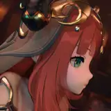
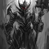
Let me know what you guys think about this. I want to get an idea of the thoughts about the illustrations before I make it official.

Personally, I think it's awesome. I can get the artist to adjust some stuff though, like proportions, level of detail, etc. before he finalizes the artwork. The runic glyphs haven't been added yet either, so that's what he has left to finish.

Anyways, hope the new year's going good for you guys. Kick some ass today, and start of that new year right.

Daniel(First Version)

Comments

Amazing illustration but it kind of looks like a Sauron knock off. Would prefer head at least retained a sense of Daniel’s humanity.

Ted Burgess

I prefer the first one makes him look scary and menacing but the second one tickles my warhammer love.

NarielV

less pink more purple but it looks asome

Awesome Was expecting less spikes

Kevin Ramos

Just that the darkness of his armor and the surroundings merge a bit more than is comfy

Kezdet

It was supposed to have some sheen on it when the light hits it. Otherwise Daniel would look like a moving blob of darkness. The eye slit is totally true, and we are working on it as we speak!

Monsoon117

According to story the eyes slit should be without nose, no nose and no mouth I think. And no color for armor, just coal black.

The head feels weird.The colour too, I tough the armour was all black with red light from the runes. I like the rest, really different in style from the other picture you use since the beginning (a nice one too) but it's good!

Ilan

I'll agree with everyone here that it needs more bulk. My main problem with it though is the head. Something just does not click about it, the eyes, the mouth?,and the collar feels out of place and silly. Other than that ... terrific work.

The mouth is missing, and i dont imagine him with a collar like in the picture. I would prefer the jagged grin and a bit more bulk. Otherwise very impressive artwork!

It looks awesome, but not harbinger of cataclysm level awesome. A lot has been said already about his bulk, but I think the problem is that he's too athletic looking. In the book he's described as this hulking, dense, imposing presence and I feel that he's built too elegantly here. (Don't make him the Hulk though :p) His head might be better if it's a bit bigger. The rest of the decorations are all in line with the first art of Daniel so no complaints there, although, and this is purely how I imagined it in my head and my personal taste, I think It would add several levels of badassery if you got rid of most of the decoration on the face itself, made it bigger, even got rid of the eye-slits and just left one big trademark jagged grin.

Pixelblade

I like it, not sure if I love it though. I'm curious as to when he retracts his armor, or a recent comparison of size to him versus something else? Also, I can totally see this armor not just doing the tendrils thing but a sword or spear coming out of the wrists.

Daniel

Think you should have him fill the screen more cut of some of the edges with only background and he would look bigger I think

Always thought his shoulders and chest would be bigger. Like and more wide spikes on the armor covered in runes.

King Gonflick

I kinda pictured the eye-slits as one piece because of the way you said that it grinned with him. it is still an accurate representation of how i saw Daniel.

Xerias

Agreed in that he doesn't look that massive. I also imagined the armor like a jagged spiky skintight suit.

make him look more skaar's size

Deltoren

i agree he needs more bulk

Deltoren

I'm going to let the artist go to town on the size and other issues. We'll get this version as good as it's going to get then see if your thoughts change on the matter. I think that's the most efficient course of action for right now.

Monsoon117

You are getting it perfectly Monsoon, sorry, cant seem to type coherently tonight.

Tooshar

He's pretty badass but he doesn't look anywhere near as heavy as he should in my opinion, also I can't really imagine this armor opening up and swallowing anything. I agree with others head is too small. Also the armor does not have the look of a "skin"

Michael Berkowitz

I deciphered through your comment, and this is what I boiled it down to. A. This armor is decoration, not something someone would wear. B. It's a part of his body, so it should be pragmatic. C. More realism would do better and mesh with the story's theme better. Am I getting it?

Monsoon117

I guess its cool? but....... frankly not anything close to what has been described, and judging from how he uses his armor to deflect things, you cant do that with ridged and many layered armor like that. Simplify it, alot, go darker, and feel free to keep things spikey at the right spots but.... this frankly reminds me more of a childs attempt at an evil knight than a semi realistic armor scheme for armor, decoration? go crazy, but this is just layers of random armor slap ped ontop of each other. at the end of the day daniel is fairly simply, yet overwhelming, keep the armor that way. The way its setup hes deflect blows directly into his gut... just.... ya, cool, yet not related to the story nor the character youve built so far

Tooshar

Like the style. Some effect on the ground to illustrate his mass eg crater, would be good. Agree with others about the head being too small.

Nathan Smith

It looks awesome with the runes it would look even better. Now it's not perfect, I feel like Zwt1995 say he doesn't as ripped or something like that as I thought maybe a light wider and if your not already doing it plz add the armor smiling, Also might be a good idea to do a size comparison with some, doesn't need to be the cover art but as a point of reference.

Lord Freezy Pop

I like it a lot, although I always pictured the spikes on his head curving backwards a bit. More of a personal preference though, whatever works. I think it's a great image.

Cole Mathews

Should be much wider across the chest and shoulders, he has pumped nothing but endurance. That body shape makes it look like he could be 6"3 and 180.

Zwt1995

The descriptions of the armor plates make them seem more angular and compact, rather than jutting out. Especially true on the shoulders. It also seems like the arms should be slightly larger relative to the body. Great other than that though. This art has a light cartoonist style to it that makes for an interesting departure from the current cover.

Jeremiah Paltridge

i saw the metal plating more like this <a href="https://i.pinimg.com/originals/ec/7a/cb/ec7acb200a53ea7671c7f47cf8b42d2b.jpg" rel="nofollow noopener" target="_blank">https://i.pinimg.com/originals/ec/7a/cb/ec7acb200a53ea7671c7f47cf8b42d2b.jpg</a>

Xwaderman

I Like it as a Battle Form, that is not something you want to hit also i can see any of those spikes extruding like wolverines claws to penetrate enemies.. I am thinking more fluid and Aerodynamic form for speed in air or earth

MattMick222

More bulk, and he does not look "evil" enough if you know what I mean

he was less spiky in my head and would need the horrible metal smile imo. thats the picture i see the best its just the smile. like this lovely fellow <a href="https://imgur.com/a/7bkml" rel="nofollow noopener" target="_blank">https://imgur.com/a/7bkml</a>

Xwaderman

Badass

Jonathan Shaw

I think the cheek blades might be a bit too prominent...

striderfighter

Looks pretty awesome, almost exactly how I had him in my head except maybe scaled up a size or two

Looks cool but the shoulder blades seem a little over the top and I think his gauntlets should be more prominent since they are his main weapon

ArchonUmbra

I always thought of him as someone who valued function over form, moving in that armor may be a bit restricting. I really like the style and the angular look but he does need some more mass and maybe a little less of a gentle purple and more menacing purple

Argetsword

Pretty good though I pictured him having daedric like armour from Skyrim

Yeah, stuff like that isn't too hard to adjust at this phase.

Monsoon117

Also maybe too busy on the helmet. Needs to be bigger with less pointy bits. Maybe a bigger mouth for those teethy smiles we read about.

Nathan

To me, the shoulder blade things and belt feel like they are a little over the top. But for the most part I like it.

Sanairb

I've imagined him to be bulkier

Honestly, he needs more bulk. Or a size comparison to other characters.

Nathan


More Creators