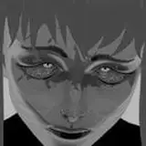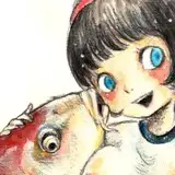
Made a lil tutorial for you peops on how I make my greyscale drawings! If you have any questions/wishes, please let me know~ c:
Time Stamps & Key Content:
Introduction [0:00-1:05]
Step 1: pre-sketch [1:05-5:50]
-Make an "uncommitted sketch" using soft brushes~
-Why Clip Studio Paint? => Great liquify tool + paper texture BG (that's pretty much it lol)
-Personal tip: Using paper texture makes orientation easier than a blank unicolored canvas + looks more appealing
Step 2: the real sketch [5:50-9:45]
-Some call it lineart, but it's more like a "committed sketch" to me. It's something between inking and sketching.
- Why Photoshop? => better art-brush engine (imo); Sketching tools in CSP feel a bit too inky to me
-Personal tip: Allow some of that step 1 sketch to shine like a "happy accident"
Step 3+4: Value fill + adding variation [9:45-14:50]
-Using solid color fill layers
-Again: only properly works in Photoshop for me, since the solid color fill tool in CSP is kinda botched
-Personal tip: don't commit too early, make those values relate properly~
-Solid colors = boring! I love to add textures and value variations on top once it's all down
-Personal tip: use textured brushes with jitter options
Step 5: Shades & light [14:50-21:10]
-Add shades with color fill layers, set them to a darkening blend mode (linear burn is my fav)
-add light in the same way using a lightening blend mode (linear dodge is my fav)
-Personal tip: Selecting the shade mask & inverting it makes it easy to lighten up the non-shaded areas, using a soft brush for gradients is kinda cool
Step 6: Overpaint & Adjust til happy [21:10-28:45]
-Using painterly brushes, adjustment layers (curves!)
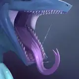
-Personal tip: Don't overdo it! Focus on the areas that matter (maws etc.). Keeping some of the sketch is part of the appeal~
Step 7: Gradient maps, colors, text etc. [28:45-End]
-Add the final touches!
-Personal tip: Gradient maps look best when they follow color theory; Use color mode to not destroy values.