SakeTami
Christophe Young
Christophe Young

patreon


Illustration Process

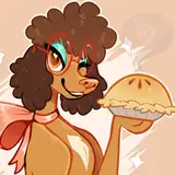
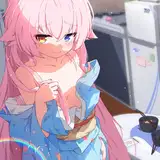
Here is a new piece and a breakdown of a more or less new process I've been using for my latest illustrations.

1. GESTURE / FIGURE SKETCH

I've been using pretty clean line drawings to establish my underlying figure so I have a good idea of the body contours and anatomical landmarks.  I also try to get a nice portrait started as a confidence booster and to get a good idea of the mood.

2. COSTUME DESIGN

Using a line drawing over my base figure, I figure out all the costume elements.  Since this piece was based on an old concept of mine, the design itself was already figured out and I just needed to dress the figure accordingly - wrapping the costume around the body and placing the elements in proper perspective.

3. GREYSCALE SHADING

Starting with a 50% grey mask, I work outward toward my shadows and highlights trying to keep the values relatively compressed. In this stage, I really try to push the 3D-ness of the illustration. This saves me a lot of time rendering in color later.

4: BASE COLOUR

I paint in my main color blocks in a group set to Hardlight over my value painting. Again, since this piece is based on my previous design, I knew what colors to put down from the start. If I wasn't sure, I would use non-anti-aliased masks to block in the colors so I can easily adjust them if need be.

5: METAL HIGHLIGHTS

I like to reserve the bright metallic for this stage rather than painting them in my greyscale value painting since they are dependent on color and reflections. I use a color dodge layer for this to bring out the saturation of the underlying colors as I paint in the highlights.

6: FINAL POLISHING

Once I'm happy with the tone of the piece, I copy and merge everything to a new flattened layer.  I can make broad changes using liquify, warp transform, etc. to fix some minor proportions. I then paintover the final piece to fix things I'm not super fond of (like how the colored portrait was feeling) and add more contrast, color temperature variation. finishing touches, and vfx (like that tiny bit of chromatic aberration).

And that's it, piece of cake! I hope you like this new piece :D Cheers!!


Illustration Process Illustration Process Illustration Process Illustration Process Illustration Process Illustration Process

Comments

Very much obliged. I’ve always steered clear of figure drawing/portrait studies because, quite frankly, they scare me the most. Yet the three things I want to master are anatomy (includes faces), perspective (complex machinery, line art) and rendering (a lot of my South Korean inspirations I love the style of).

JamFilledJars

I am fortunate to have experience in traditional painting and a tendency to border on hyperrealism. Maybe too much, but I'll learn to simplify. The real problem to overcome with this method (for me) is a really pleasant, interesting, but consistent color to the shape. I always do the tests on the figure. Naked and feminine. Traditionally the best to pushing learning. I got excellent results. The coloring and the final steps satisfy me less. I follow the works of the great Christophe and never stop asking myself questions and... paints, draws for many hours every day. I want to learn with humility. Maybe it's me and my ambitions that are the real problem. I admit. Hugs to all.

Bounty

My interpretation of this is that if Christophes shading starts with 50 percent gray, he tends to be painting with light more, in other words he starts with midtones. When he starts with 20 percent, he seems to be painting the shadows and painting towards midtones. In other words you could paint two identical sphere studies. Start one sphere with 20 percent gray and you shade it to about 70-85 gray and in very few strokes you've painted a sphere with just adding darks. Then make another, start with 50 percent and again you push the dark to 70 to 85 gray, but to get the shape visible you add the lighter shade of 20 percent gray. Both have same tonal range, just a bit different approach. At least this is what I've learned, start with dark and paint the light and if start with light, paint the shadows. Well obviously, you paint them both but emphasize which feels more suited for your eye and skills, which would you prefer to paint to get the shapes going. And end results, although varying a bit, in tonal range are quite close to each others. This 50 gray and adding light reflects towards the more traditional mediums, like oil painting perhaps? More often than not, you start painting the midtones and darks and adding lighter tones because some says it's easier to paint the light than paint the shadows. Would love to get Christophes insight for this, do you just go by feeling or is it because if style or scheme of the painting that dictates the procedure?

Giormio

Love the piece! I see you aren't doing the Linear Dodge(?) thing on you value painting with the colors underneath. With this you painted the colors over the top on a Hard Light layer. Is this a newer process replacing the old one? Or is it just a different technique you are trying?

J.R. Barker

Hey! There's some truth to Roman's answer, but I can ellaborate. Practicing longer (30min-2h) figure drawings and paintings every week has really helped me develop an an intuition about drawing anatomy and eye for details like the folds, creasing and overlaps of skin created by different contortions of the body. Value or colored figure paintings also really help develop an intuitive sense of light and form - to FEEL the 3Dness rather then just painting it.

Christophe Young

You can download my image of the value painting and sample tye colors to see exactly what values I'm using to compare if that makes it easier. I get it's a bit confusing because I vary my approach, but the core idea stays the same - keep a balanced and compressed value painting to allow room for the darkest darks and brightest highlights in the final color render pass.

Christophe Young

there is only one answer to your question, practice and analysis

Roman Antipev

damn I love it

Roman Antipev

Ciao and congratulations as always. Interpreting the latest live performances I understood that the first mask was 20% gray and that you based the shadows starting from 50%. So I did several tests and I really liked the method because with 4 gray values the three-dimensionality of the shape is wonderful. Especially what happens to the core shadow, reinforcing it with a value between 70-85%. Now you specify that you mask at 50% (flat?) and this means that the shadow values move towards a maximum at 90-95%. Starting from 50% I am forced to work the midtone better and I do this by thinking more about the light and highlights of the final result. It seems to me that in this way we risk fighting with some tonal values, but in the details the sculpture is more refined. So from 50% we go down by working on the medium tone and then reinforcing the core and cast shadow, also thinking about the bounce lights. I tried it now. Did I get it right? Thanks for this very useful post, but if you don't answer I'll go crazy. Ha ha!

Bounty

Is there any efficient way to study figure drawing like this per chance? Especially the subtle intricacies of folds and how light and shadow interacts with those forms? It’s something that I marvel while looking at this and the other pieces, but it still eludes me.

JamFilledJars


More Creators