SakeTami
RAWDAWG COMICS
RAWDAWG COMICS

patreon


Clean v Rough (actual comparison)

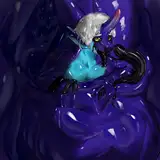
I told myself I wouldn't draw on the weekends but I always somehow break that rule. I redid one of the comics so you guys could more accurately see the difference between the clean and rough line art. Which do you prefer

Clean v Rough (actual comparison) Clean v Rough (actual comparison) Clean v Rough (actual comparison)

Comments

i like it when you change it up, so i think it should just depend of your mood or the tone of the comic. the style variety is part of what makes this such a delight so why not just have an additional style?

Sarah Richards

It is easier to tell the difference here. I like rough for the comics, a lot of character, feels like how ink really acts sometimes

Peligrin

I like em thicc

Buttmunch

I like clean for everyday uploads but think rough is worth using for certain comics where the premise or theme is, well, rougher.

Jacob Gay

+1

Axel

The clean looks much better due to the dramatically improved line weight. The shapes are also a lot better defined, especially Bingus's hands and cheek tufts and Stahli's eyes in panel two. In the rough version, I think Bingus has much better eyes in panel three (bolder and more alluring, clearly looking at Stalhi). I also prefer the asymmetry and drape of Bingdad's suspenders in the rough version and the coarser body hair in panel 4. I combined them (+ other tweaks) for the best of both worlds: https://postimg.cc/wt0Zqp8k

Paracomplete

I think consensus is clean

Torridy

Clean looks better with the new style. I like rough better with your older style.

Zep Pez

no clue

Baxy

Both look great! The rough has more impact on the “coarser” subject matter!

Duncan Sutherland

I think since the patterns you've added are much more intense now, cleaner does look nice. But when patterns were less intense and dense, the jagged adds its own charm.

Jon Boopin


More Creators