At least for tonight, the votes are showing that most people want floating text to replace the speech bubbles in the images. So, as a more e
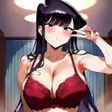
At least for tonight, the votes are showing that most people want floating text to replace the speech bubbles in the images.
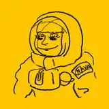
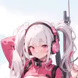
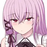
So, as a more expanded example, I decided to create a “semi set” so you can get a better idea of how the images will look from now on—same quality, same style, just with text that’s much more readable, longer, and way better for the narrative.
Over time, I want to refine it even more—maybe add some onomatopoeias, more expressive lettering, and stronger details, but for now I feel like this is a big step forward. (mainly due to the improvement in each set creation time)
What do you think? Do you like it? Does it work for you? Do you think there’s too much text? Should I make the letters smaller? Use a different color? Is there anything you’d like to see changed? Feel free to leave any thoughts in the comments!
(Sorry if the translation isn’t 100% perfect—it’s pretty late and I didn’t want to go to sleep without showing a WIP. My words don’t come out great at this hour, but if you all aprove it, I’ll refine it, make more images, and post it!)
Sapık Mıyım?
2025-11-05 03:51:01 +0000 UTC