![[ARCHIVE] wine-o-clock somewhere (2020)](https://img5.saketami.com/storage/9/ou/kc/9a2cd0-019e6f95-5387-744d-a413-c1e1f15024c1.png)
![[ARCHIVE] wine-o-clock somewhere (2020)](https://img5.saketami.com/storage/2/ya/xj/9a2cd0-019e6f95-538c-7eb8-9919-82845b516062.png)
![[ARCHIVE] wine-o-clock somewhere (2020)](https://img5.saketami.com/storage/9/yh/pl/9a2cd0-019e6fa9-d5c4-76db-ae1e-295b873d3c65.png)
![[ARCHIVE] wine-o-clock somewhere (2020)](https://img5.saketami.com/storage/9/yp/ow/9a2cd0-019e6f95-53ca-74e0-8a85-63f309525336.png)
![[ARCHIVE] wine-o-clock somewhere (2020)](https://img5.saketami.com/storage/6/ij/qh/9a2cd0-019e6f95-53eb-705e-9b35-6c05ac40e012.png)
![[ARCHIVE] wine-o-clock somewhere (2020)](https://img5.saketami.com/storage/9/mh/os/9a2cd0-019e6f95-5400-7eac-9800-baa144f2bb9e.png)
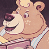
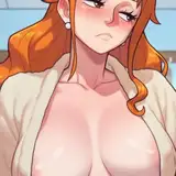
This one is actually quite a recent commission, finished in October for my pal Ruffy.
It took me a long time to finish this piece as it has been a rough 2019-2020. Thankfully, Ruffy was very patient and i made sure not to charge him until i knew things were properly in motion. I admit I struggled a lot with this one, still being pretty inexperienced when i began, hence the long time to make it. I started it while not yet on medication and my process was a lot more unfocused and prone to issues as a result. Realizing how little i truly knew did encourage me to study a lot of fat art and photos for reference. The time i spent doing that while on a bit of a mental health hiatus meant i now struggle a LOT less than i used to, though it did make me feel guilty for avoiding it for so long. Thankfully, Ruffy is a close friend and he prioritized my mental health first. A very good lion.
The level of finish and the environment wound up being an extra thing i threw on as an apology of sorts for taking so long. I originally was only paid to cel-shade and throw a scribbly, very simple environment onto this piece, but i just got SO many ideas and i wanted to practice them. Ruffy thankfully welcomed this, despite the wait. I'm really proud of the results! Nature scenes are hard, since they follow more organic rules than a boxy room does. To convey proper depth and perspective required a lot of referencing and going with your gut. I still have a lot to learn but i did cram a ton of cool stuff into this despite it being my first piece of this kind.
The full-painting style i used here came somewhat easily, though i did do a lot of color theory reading beforehand. Ruffy and I talked a lot about James Gurney's Color and Light once i got to the painting part of this. I highly recommend checking it out if you haven't already. Gurney is a brilliant artist and a lot of his traditional painting techniques can be applied to digital processes with a bit of know-how. I'm really interested in the chapters on gamut-masks and i plan on trying to adapt those ideas into my digital art more going forward, since i wanna get a control over limiting my palettes better. Beyond that, the painting was mostly just making smoother transitions within my existing cel-shading technique. I really had to be conscious of how to juggle contrast and color saturation on this so it didn't look muddy or oversaturated. It was tough but a lot of fun!
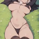
For the slob fans, i improved my gas technique in between this and the last time i drew it. I spent a lot of time studying how people draw that sort of stuff as well as pictures of smoke stacks, clouds, and ink droplets landing in water, which sketchbookrat highly recommended to me. I specifically mention this for anyone who wants to learn how to draw gas better. Trust me when i say it works. It all just comes to me way faster and i'm able to have a lot more fun drawing gas now. I also practiced layering the translucent clouds more than i had before, to create the illusion of deep/dense fog. I think it's pretty effective! Obviously not shown above, but you can view it in the attachments.
Below i've included full resolution files for the clean version of this drawing and several alts covering the varying levels of messiness that i added onto the finished version. I figured if i had layers for all of them in the file i might as well include them all as options for you guys, right? I plan to continue doing this for future slob pictures as it makes for easier working and a nice bit of extra content for everyone. Enjoy!