Dang, this crunched my time. Uii. Anyway, I'm currently working on planning some upcoming comic stuff. Force of Nature will continue with the next chapter... the main story, of course. And I will also have a new comic. But besides character and script work, I'm also sitting down and taking a close look at more of the design aspects of my comics. I've never really put down rules and guidelines when it came to onomatopoeias and other text elements. I always go back and forth and change things page by page depending on how I like it that week, and I want it to be more consistent. Not just one type, but a guide to what styles to use when, etc.
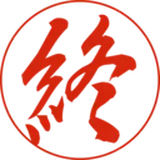
I also wanted a new font for my comics, I really like comics where all the letters are uppercase. I think it looks very classy. I made a new font for myself and even made a bold version of it as well. I used Calligraphr, for anyone interested in that. I'm not sure if I'm 100% pleased with it yet, but still.
I also made new reference sheets, very nice and clean ones, for my new characters. All that to say, I'm trying to grow in more ways than one when it comes to my comics. I always feel like I try to push things to the front so people can look at them, but forget to take care, plan, and pay attention to all the stuff that takes time but people don't really notice. But I do!
And it is important for the overall experience, I feel. A bad font or weirdly placed or sized speech bubbles can really sour the experience of reading, but really good onomatopoeias and panel layouts can really elevate it. I wish I had a big team to work with me, but it's just me. And I have been growing my skills, and I will do my best to keep at it! Thanks for being here.
Bubble
2025-12-08 11:01:33 +0000 UTCBubble
2025-12-08 10:57:48 +0000 UTCCazapalas
2025-12-08 08:45:08 +0000 UTCKuram Kitsunea
2025-12-06 23:57:36 +0000 UTC