
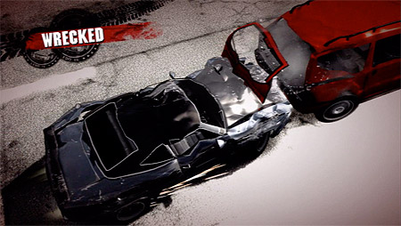
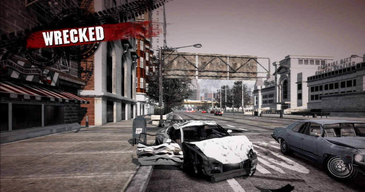
This episode went through a lot of rewrites. Part of that was simply the need to keep my meandering writing habits in check - I love this game, and it was pretty easy to go off onto tangents. I had wanted to say something about the evolution of its artstyle (the original billboards didn't glow and had more muted colors, and the original crash palette washed out most colors but over-saturated red). Also both the soundtrack and "Paradise City" itself deserve more coverage for how they impact the game, but, you know, ContentID. Also, the way the game scales its difficulty by event class is an interesting way to promote open-world mission selection.
But really, a lot of the editing was just trying to figure out how to frame the way Burnout Paradise thinks of cars. I didn't want to be reductionist and boil the game down to just some kid's plaything, but it's hard to describe iconography and symbolism of cars removed from any specific makes or models. But there is something there, I think! Like, an abstract notion of "car-ness," especially in automobile obsessed America. Some of it is the common language of road signs and markings. Some of it is the materials cars are made of - leather and glass and polished steel and chrome. And some of it is the sensations cars provide - a hodgepodge of smells and sounds and sights. Pixar's Cars tapped into a lot of this - I mean, look at that logo, with its chrome and speckled red paint!
If I had to identify an underlying thread, I think it's nostalgia. Both Cars and Burnout Paradise chase this image of cars from the past that maybe didn't really exist. For Cars it's a sort of 1950's-infused lamentation about the increasing irrelevance of smalltown middle America with the arrival of freeways. For Burnout Paradise it's more of a "I Can't Drive 55"/"Paradise City" 80's-era teenage love of gas-chugging power before global warming made us feel guilty about that. Cars: Aspirational symbols of the youth that become nostalgia icons as the decades pass? Maybe.


