SakeTami
cathoderaydude
cathoderaydude

patreon


Previews (better)

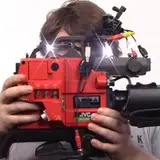
I didn't have my studio lights up for the previous images; I still don't have the whole setup hung up (hence the harsh shadows) but I wanted to show you that under better lighting the color is a lot more vibrant.

My eyes kinda auto-white-balanced the previous images and when I went back to them I went "oh no these look much duller than reality"

Previews (better) Previews (better)

Comments

Few coats of Sherwin Williams "Naval" flat. I have a green screen for chroma key if I want to do that, this is meant to be a pleasant flat background

Cathode Ray Dude

Whatever it is its super matte. Looks good, though I don't know how it would go with chroma-key

I do have a greenscreen that I've never really experimented with because I don't like the greenscreen look - but I've thought of some ways it could be useful for future projects, so yeah, I'm going to be doing that. My intent with the blue was for it to be "off-black" - I can't think of a way to see if this was the right decision other than to just shoot a video in front of it and see what happens though.

Cathode Ray Dude

Also, now seeing the finished blue wall, I think you should consider getting a cheap greenscreen to try that method, then it could be any color you needed. I just feel the blue looks like it was supposed to be black but it isn’t? Overall, it already looks a ton better and more professional, just remember the rule of three point lighting, just like stage lighting!


More Creators