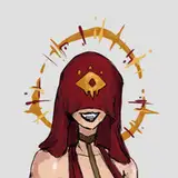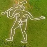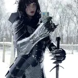
It's been a while but, as you can see, things are moving forward. Those are pages 7 to 10 inked and in HD.
The areas left blank where the underground lake is located will require special attention when it comes to coloring... I will do some tests to find the best solution between inking and coloring... Given that the lake is black, I am still hesitating between treating it as pure inking...
It is extremely rare for me to question my graphic skills, particularly when it comes to equipment or digital tools. That's why I think it's appropriate to tell you about a small revolution that took place a while ago in my Clip Paint Studio brushes...
A few weeks ago, I retired my old brush called Logan sk, which had served me faithfully since the beginning for my pre-inking sketches... So goodbye Berthe (as we say in France), and welcome Logan New sk, which is actually a watercolor brush. And for some reason, it's perfect for sketches. I feel like it boosts my sketches without me having to go back over the lines several times to make them effective. In short, I love it!
And now, as I try out new brushes, I've discovered a tool that is revolutionizing the way I ink my work.
I spent some time adapting my current inking brush, which I called Logan Ink. I was completely satisfied with it and it has been with me for a long time in my work. I really liked the way it imitated the thick and thin lines of my real brush...
But then I came across a brush called デジー丸ペン (Digi-Maru pen) N° 1719810 that a mangaka ぐよもも (GyoMomo) published on the Clip Paint library... And something clicked inside me, a letting go of the aspect of my inking that I hadn't dared to allow before, but which, through this brush, makes my inking work just as emotional but above all less time-consuming.
It was also while watching videos by renowned mangaka such as Naoki Urasawa that I realized that striving for the perfect line didn't make my comic strips more effective, but rather distracted the eye from the reading.
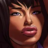
That's why some of you may have noticed a noticeable difference in my style in the Pornomicon - First Encounter comic strips.
The other reason for this change in style is that I've always had one regret about the first Pornomicon. I originally wanted to create a darker story, but my very comic-book-like and colorful style, where shadows are completely absent, while contributing to the “success” of the comic, also betrayed my original intentions, which I intend to honor here. (Plus, digital ink is cheap, so I can use as much as I want!)
And I don't even talk about my new brushes I use for the rocks and backgrounds...
I wanted to share all this with you because, for me, it's quite an important event that I hope will allow me to work faster.
Thank you for reading to the end!
Manly hugs!
Reza
2026-01-31 14:39:38 +0000 UTCArnaud
2025-09-28 07:38:35 +0000 UTCmatou06
2025-09-23 15:11:33 +0000 UTCLogan Kowalsky
2025-09-22 13:13:27 +0000 UTC4nt0n3
2025-09-22 10:41:23 +0000 UTC