

English translation is at the bottom
こちらでは初のブログ形式になります!
ずっと何か絵に関することをブログにしていきたいなと思っていた部分がありましたが、FANBOXでようやくやっていこうと思い立ちました。
どういうことをやっていこうかというと、「下手に見せない描き方」というもので、絵の上達に役立つ知識的な部分に注力しようかなと。(考え方、の方が良かったかな?)
枚数描いて、しっかり観察して、ということよりは知識でカバーできる部分は沢山あると感じていますのでお役立ちしてもらえたらと思います。
絵を描いてるのを楽しんでいる方向けに全体公開の分はあまり難しくない議題にしたいと思っています!
基本的には絵にダメなことはないと考えていますし、私自身完璧にはできないのですが、意図せずに見栄えの悪い選択をしないためにもシェアしていけたらと思います。
ーーー
まず接線って何ぞや、というのもあると思いますが要は描いた線と線との位置づけ、接点のことで、それに注意しようということです。
デッサン力などとは別に絵作りにかかわる部分です。
構図的な考え方に通じますが、具体的な回避例になります。
以前からなかなか日本語の説明記事がないのをやきもきしていたのでよく見る接線についての英語の記事を紹介しつつ大雑把に説明します。(イラスト付きなので意味は伝わりやすいと思います)
The Art of visual Thinking
http://artofvisualthinking.blogspot.com/2012/10/those-pesky-tangents.html
題目だけ翻訳すると、
1:直線上の線
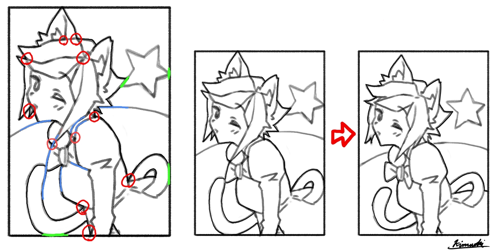
帽子と屋根がつながって見えています。
2:平行な線
背景の線が人物のシルエットを沿うように平行になっています。
3:集中する線
人物の線と背景の線がいくつかの点に集まっています。
4:輪郭が重なる線
1枚目は輪郭同士、2枚目は枠がぴったりくっついてしまっています。
5:延長線上
傘の延長線上にグラスの輪郭があり不自然ではありますが視線誘導的。
重要なのは「意図せずに」なってしまっていることで、特に5番目とかは意図したものであれば問題ないと考えます。
ただ、このすべては不自然で違和感のあるものにしてしまうのでご注意ということです。(5番は使い方次第ではで視線誘導にもなります!)
大雑把ですが一転に集中する線(赤)や延長線上にある線(青)、シルエットが重なる線(緑)などの「不自然」な箇所が該当し意識して修正や回避している点です。(右の絵が修正後になります)
例が分かりづらい・・・(汗)
人によっては簡単に見えるかもしれませんが、パズルのように複雑化し侮れない部分だったりします。
ただ、「あっ」と気づいたら回避、修正ポイントとして分かりやすいと思って紹介してみました。
個人的には2番「平行な線」は結構注意しないと髪の毛や尻尾など無意識に前面にあるシルエットに沿ってしまうことがあるので注意しています。
これは多くのアートに通じるもので、写真でより多い9つのポイントを紹介している英語記事もあるので載せておきます。
Avoiding Tangents
https://emptyeasel.com/2008/11/18/avoiding-tangents-9-visual-blunders-every-artist-should-watch-out-for/
-
どんな感じでしょうか、多くあるパーツの描き方のようなこともあるかもですが、どちらかといえばこのような感じで頭の隅に入れておくと上達につながりそうな情報を出していけたらと思いますのでこれからもよろしくお願いします。
以下英文
----
This will be my first blog format over here!
I've been wanting to blog about something related to painting for a long time, and I've finally decided to do it on Fanbox.
I've been wanting to write a blog about something related to painting for a long time, but I finally decided to do it on Fanbox. What I'm going to do is to focus on knowledge that will help me improve my painting, called "How to draw without looking bad. (Or maybe "how to think" would have been better?)
I feel that there are a lot of things that can be covered by knowledge rather than just drawing a lot of pictures and observing carefully, so I hope this will be useful.
For those who enjoy drawing, I'd like to make the agenda for the general public not too difficult!
Basically, I don't think there's anything wrong with painting, and I can't do it perfectly myself, but I hope I can share it with you so you don't make unintentionally unflattering choices.
---
Let's start with the first article on the concept of tangent lines.
First of all, you may be wondering what a tangent line is, but the point is that it is the point of contact between the drawn line and the line, and you should pay attention to it.
This is a specific example of how to avoid it.
I've been frustrated with the lack of Japanese explanations for some time now, so I'm going to introduce an English article on tangents that I've seen often, and give a general explanation. I'll try to give you a rough idea of what I mean.
The Art of visual Thinking
http://artofvisualthinking.blogspot.com/2012/10/those-pesky-tangents.html
Just to translate the title...
1: Lines on a straight line
The hat and the roof appear to be connected.
2: Parallel lines
The lines in the background are parallel to the silhouette of the figure.
3: Concentrated lines
The lines of the person and the lines of the background come together at some point.
4: Overlapping contour lines
In the first picture, the outlines overlap each other, and in the second picture, the frames fit together perfectly.
5: On the extension line
The outline of the glass is an extension of the umbrella, which is unnatural, but it is also eye-catching.
The important thing is that it is "unintentional," and I don't see a problem with it as long as it was intended. Especially the fifth one,
However, all of this can make things look unnatural and uncomfortable, so be careful. (Number 5 can also be used to guide the eye, depending on how you use it!
This is a rough description, but "unnatural" lines such as lines concentrated in one direction (red), lines on extended lines (blue), and lines where silhouettes overlap (green) fall under this category, and I consciously correct or avoid them. (The picture on the right is after the correction.)
This example might be hard to understand... (sweat)
(The picture on the right is after the correction.) The example is hard to understand... (sweat) It may look simple to some people, but it can be complicated like a puzzle, and it is a part that should not be underestimated.
However, I thought it would be easy to understand as a point to avoid or correct if you notice it.
Personally, I pay attention to the second point, "parallel lines," because if I'm not careful, I may unconsciously follow the silhouette in front of me, such as the hair or the tail.
This goes for a lot of art, and there is an article in English that shows 9 points with more photos.
Avoiding Tangents
https://emptyeasel.com/2008/11/18/avoiding-tangents-9-visual-blunders-every-artist-should-watch-out-for/
-
I'm not sure what it's like, maybe it's like how to draw a lot of parts, but I hope I can give you some information like this that you can keep in a corner of your mind to help you improve.
"How to draw without looking bad" series


