SakeTami
toms3dp
toms3dp

patreon


Logo thoughts?

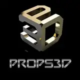
New year, new you, right? I've been playing with the idea of a bit of a logo and channel redesign, as the current design language only works well in a few places - and even there, it's a bit awkward to use.

This is a concept that I created in Illustrator and would love your feedback on it! Your opinions on whether I should make changes to the channel name to make it easier to remember and find were already super helpful as the consensus was to keep "Tom's 3D" as the main name. 

So let me know what you think about a simple text logo like this - would you still recognize the channel?

Logo thoughts?

Comments

Tom, I'm a career designer who specilaity was logo/identity creation. Doing this right is harder than it looks and using popularity as a metric never goes well. If I can assist you in your quest and are open to professional advice/input at no cost, DM me. Be glad to help.

Tim Celeski

I like it! I think the new name is easier to remember too. I love the somewhat 90's feel of this. I do think the 3D should be slightly more separated and the TOMs part needs something more.. maybe an outline or something similar!

Chase McNamara

I don't think that it is a good idea. Looks not very appealing and does not reflect the level of professionalism that you have on your channel.

Daniel Crosslink

Its got a definite 90's neon aesthetic, which makes it memorable and I like the visual joke. Practically, I am not sure unless in a good environment it will stand out which might be an issue for a mixed media platform. On white too, light, and as a stamp on video I can’t see it popping. I am an engineer though and can’t do prettiness As a 3D printing channel, i feel like others have said, a logo that works 3D printed makes sense. I.e. not so much on color but a shape that would print out. Don’t need to plaster prints of it everywhere but it conveys the channel well, even if used as an easter egg. If you want to make it useful as branding why not do it as a benchy / torcher test thingy.

James Koch

Tom - to me your YouTube Channel defines what 3D printing is all about. You're the 3D guy for me - I've learned a lot from watching your videos. For that reason, my suggestion would to simply do "3D Tom" instead of your suggested logo. Perhaps make a "Tuggy" image and make that part of it :) I always look forward to your videos. Thanks for what you do.

Peter Larsen

not that big of a fan. What happened to 3D senpai?

NK Cubed

Maybe if that logo was printed on a maker coin or something, then the photo of the print was the logo. It doesn't communicate printing very well.

Benjamin Helton

Not a fan of this one. The colors are fine, I like the hotline, 90s, neon theme... But the design itself is very flat and doesn't feel modern at all.

Nathan Prewett

Maybe something that make a connection to 3D Printing, for example the surface of the letters with a FDM printed texture. This way people may think it's about 3D Rendering.

Ewald Ikemann

Don't use this one, please. It is (a) too retro and (b) too annoying on my eyes - similar to what others said.

Sven Mueller

It's simple and direct. My suggestion is to give your name as much space as the 3D. I think you should have the top billing :-)

Nick Nikzat

I don't really like it. It looks very retro and reminds me of bad 3D Movies with colored glasses.

Moshe Schmidt

Quick sketch for inspiration; <a href="https://cloud.netzspielplatz.de/s/yLwDmp8xe5kmsCk" rel="nofollow noopener" target="_blank">https://cloud.netzspielplatz.de/s/yLwDmp8xe5kmsCk</a>

Thomas Herrmann

Clearly in the minority, but I like it. The 90s neon aesthetics are coming back (see: Into the Spider-Verse), the stereo look fits the channel's theme, and I personally really appreciate this style.

LKM

Zimri Mayfield has a Youtube channel that is dedicated to fixing logos, maybe you can do a collab?

John Arild Lolland

If I put 3D glasses on will I actually see the 3D move ;-). I kinda like your current logo better. Any way to incorporate the 3D in your current one.

Core3D.tech

Not like that logo too, seems very old like a 90's. Maybe some member want do some logo or couple of logo types to you? I been many forums, communitys where users do logos to site/forum etc and owner/vote take best one. I dont so good to do logos, but many are and maybe some Patreon supportes here are. Of course this only idea of my head :D

Pasi L.

Honestly, I rather like your current logo.

jp.nc

Anaglyphic 3D? I can already picture your next clickbait video featuring a $30 3D printer that is just an inkjet printer printing stereoscopic images.

John Arild Lolland

Looks horrible, defocused. Please give it another try

Martin Gerken

Well... since you asked. The colors hurt my eyes. Why not design some form of a shadowed surface pattern?

Matthew Byrd

[Just to be clear - printing will murder whatever logo you come up with :-). I'm just suggesting to not have highly-contrasting colors as a foreground component, to help moderate the level of carnage.]

Scott Hess

Keep in mind that the printing process is going to murder your logo. I'm thinking of this mostly for if you get magazine coverage when building your brand, though I guess it would also apply to things like flyers if you had a booth or something, and probably business cards. There's a whole deep craft of this involving Pantone colors and color spaces and other things, but the gist of it in this case is that print is unlikely to maintain the relative weights of the colors very well. Heck, badly setup monitors also probably won't.

Scott Hess

I get the idea of wanting to refer the chromatic stereographic effects before the polarized glasses came along, but not a fan of the colors. If I may, I would suggest the same text but using shadow projections to give it depth. Maybe play around with colors along a similar palette to give shading and use contact on the background color

Jonathan Charnas

I like the throwback to the old red/green 3d glasses time but together with the text color it hurt my eyes a bit... :(

Rudolff Vang

Never pair reds with blue like that. It’s visually jarring.

Glen Hoag

Not sure I am thrilled with that logo. Seems 1990's color scheme and a bit web 1.0 appearing. But don't change the content (well I'd love more of the reviews along with your project videos). I have never watched one of your project videos without getting either an idea for a project or learned something I didn't know in 3D printing.

Henry Feldman


More Creators