So I have been having quite a difficult time with these silly shirt designs over the past few months. A new print test just arrived today with more disappointing results. I wanted to take a moment and update you all and explain the issues I am encountering and why this has been so delayed.
In the past I have been using Red Bubble for selling all of my shirts. I have sold hundreds of the Raptor designs over the years, but I have encountered a problem with the way Red Bubble operates- they contract out third party printers all over the world to print and dropship designs. This cuts down on costs, especially manufacturing overseas, but it leaves a lack of quality control and consistency and occasionally I get some issues reported to me from customers. Plus they take a pretty large cut of the profits and I know I could be doing things more efficiently overall, and though I've had success with the raptor designs through them (minus the black colored shirts and often shirts printed overseas which most often produced the white ink issue you see here) I did not have much success with them printing my "Furious Night Dragon". Thus, my campaign to open for pre-orders to help front the costs of purchasing test prints from all sorts of printers began.
Well the timing of finishing the design and starting pre-orders was a little inconvenient when we unexpectedly were able to get last-minute tickets to Burning Man and I suddenly found myself launched into a whole series of events on the adventure of a lifetime; exploring incredible opportunities and making new connections in my life and for my business, even knocking out bucket-list items like skydiving and spending some time outside the country. But I did have lots of research done on shirt production and communication with printers during this time period, and ordered some tests with various results before I left and after my return home.
As of today, I have two more shirt orders from different companies on the way that I hope to receive by the end of next week. If they both don't pan out then I will be going forward with a local printer whom I can more closely work with and have a direct say in the way the shirts are printed. There were many desirable things about how their test came out back in July (which you can view here: https://twitter.com/CanineHybrid/status/885355515387236352) and I think I can bring it to the place I want them to be with a few more weeks of tweaking and tests and understanding their printer, software, and limitations of both.
My goal with this has always been to provide you all with the absolute BEST and highest level of quality control possible, providing designs with clear, vibrant details and printed on shirts that are soft, comfortable, and inviting to wear. I chose to upgraded to nicer shirts because you guys deserve to wear nicer shirts and they honestly say a lot about my brand and my work. This means I'm being exceptionally picky about my printer and I hope that all the delays in the production will be more than worth it in the end so I thank you all very very much, who have taken advantage of the pre-order discount and supported my efforts!
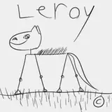
So, why are these designs not printing right, you may ask? I am using a type of printing called "direct to garment" (DTG) which can print more or less a full color spectrum. We're not limited to use of single colors and charged per color like screen printing/silk screen, but just like the ink in your printer there are issues and limitations. For example, if you put a black piece of paper in your printer, you wouldn't get any results because the black paper and the inks are mixing together. Same thing happens with a colored piece of paper- whatever the color of the paper is will make the print turn out that color. Printing blue ink on a red piece of paper will make the result purple, or printing blue ink on a yellow piece of paper will make the result green. So, these special DTG printers have a trick: white ink. They will first print a layer of pure white ink in the shape of the design and then the colors print on top of the white to ensure the colors don't mix with the shirt color. In theory this works great but you can clearly in practice observe some issues. And worst of all, I have areas on my print that need the white (the character) and others I don't want it on at all (the pocket shadows)! And I'm running into the issue where printers will do "all or nothing" with white ink, like the print test seen here, instead of high control over the amount of white ink laid down to support effects of transparency or color bleed on dark and colored shirts.
What I have come to learn and understand is that not all companies or all printers are created equally. Every single one of them is running different settings and calibrations and software and I see clearly the biggest difference in how they handle white ink. And BOY does quality vary a lot! Another very important factor is the kind of shirt you're printing on (smoothness and evenness of printing surface as well as material, for example cotton ringspun is often cited as one of the best) and how well a company pre-treats the shirt with special chemicals to allow the print to adhere properly before printing (which is what gives it that odd sweet smell that disappears after washing). It's quite the headache and turning out to be a pretty expensive endeavor.
So with the latest test I wanted to see how the printer handles colors, size/placement on the shirt, print area boundary, and transparency/white ink. I even sought to attempt to color-correct the pockets by adding in the closet blue color I could guess, based on my screen and shirt color samples in real life, both with and without color bleed around the edges of the drop shadow. And it turned out rather terrible.
So wish me luck; the hunt for the perfect shirt company continues! Stay tuned for more updates and I hope to be able to report back with good news soon!