**Each section has been transposed below in case the text is hard to read on certain devices, or if translation is needed for certain parts. :)
Everything mentioned in this post is my opinion - this isn't a statement on what you should or should not do in your art, it is just based on what I prefer to do and see.
--
One thing I see quite consistently among new/experimenting Blender artists, particularly in the WoW scene, is dark lighting. I understand that a lot of NSFW creators want to create moody/intimate lighting but the execution isn’t always on point.
Brightening my images has honestly not taken too long to master, and one setting in particular really helped to bring up the shadows, even before any lighting has been implemented. This is the world surface.
I like to think of the world surface as more of a blanket light across the whole piece. You can alter the colour and intensity, though I don’t tend to go above 1 strength as the brightness/darkness of the colour you choose can have quite drastic changes already before you even begin to consider the strength of the world surface.
The world surface affects everything in the image, but isn’t directional. It won’t create shadows like the other types of lights will, so I personally just use it to add a colour tint to my images (e.g. a dark red/amber colour to replicate indoor, candle-lit lighting or a blue tone for a nighttime scene) and brighten.
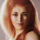
Some examples of colour coordination with the world surface:
(Image)
Here I used a dark, deep red to compliment the orange/yellow sunset behind the character and the character’s clothing, to add a warm atmosphere to the interior.
(Image)
Here I used a blue world surface to compliment the warmer tones from the candle. This also helps to create the illusion of a nighttime scene, and a cool-toned atmosphere.
An example from before I used the world surface to brighten images:
(And what I’d change if I re-made it today)
This image is a good example of what I see quite often with people newer to using Blender’s lighting systems; an extremely bright source lamp, no world surface integrated at all, with a complimentary coloured lamp on the oppposite side of the image (or just somewhere in the ‘room’ in general).
Whilst the colours aren’t bad, and in fact I encourage people to use similar lighting set-ups in terms of placement to balance their images, without the world surface or any kind of blanketing brightener (sun lamp, area lamp, etc) it just looks far too contrasted, to the point where the shadows look sharp, muddied and generally unappealing.
Whilst this might be more realistic to a point, for example if you turned on a bright torch in a more or less pitch black room, for artwork I think that it’s important to perhaps stray from reality in favour of making your images more pleasing to look at. Think of all the details that are hidden when the world surface isn’t implemented - in this image alone you can hardly see the table texture on the left side of her, or the scroll, or the floor texture. That’s a huge chunk of the image that the viewer will struggle to see.
If I was to remake this image today I’d not change the lighting colours. Instead, I’d simply apply a pale blue-toned world surface to pull up the shadows to the point where the details in the image could be seen, and to soften the shadows around the character’s joints, making her form stand out a little better. I’d probably also add a light source somewhere of to the left of the image to add some focus onto her raised leg and that side of her body.
I hope this was at least a little helpful in regards to understanding lighting a little better and how to brighten images with a fairly simple step. There’s a lot more to Blender lighting, of course, but this is a good place to start if you’re struggling to brighten your images.