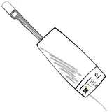
Station Icons Poll
Added 2021-08-12 10:44:40 +0000 UTCWe've been playing with various ideas around station icons and would love your opinion. (this is a non binding poll) Classic station icon, or simple circles. Let us know why in the comments.
Examples:


Comments
Can you make them without a fill, so that they are just a ring?
David Rollinson
2021-08-13 11:39:01 +0000 UTCNow you've done it, I quite like the small circles.
David Rollinson
2021-08-13 11:35:09 +0000 UTCScaling down the tower doesn't work very well, especially on lower resolution screens (one of the reasons we started this poll :P ) We'd have to change the design significantly for a smaller tower
SondeHub
2021-08-13 00:54:50 +0000 UTCMaybe a slightly smaller tower for less clutter.
Ivan Smith
2021-08-12 22:28:40 +0000 UTCThe simple circle design is live at testing.v2.sondehub.org if you want to test. We are also testing out some websocket changes so don't mind the lower message rate
User2048
2021-08-12 11:44:32 +0000 UTCSmaller version of same symbol - or just a simpler antenna symbol?
David Rollinson
2021-08-12 11:27:59 +0000 UTCI like the original icon because it's clear what it is. A smaller version representing an autorx receiver would be nice. Small circles helps with the clutter too though.
Tim McMahon
2021-08-12 11:11:06 +0000 UTC