Following up on our last post about refactoring literally everything, I'm finally glad to be able to share this WIP of our new Character pages.
Some of you mentioned that you were satisfied with the current sections available, so I've prepared this profile to show the same sections you already have, as they would look rendered into the new app.
As shown in previous screenshots, the actual profile content can be modified or swapped to include other widgets, with additional named sections (which will also show up in the sticky side nav.)
There will also be more metadata available in that sidebar, which includes creator and table of contents (shown), as well as character created/views statistics. If your character has a color scheme that you've marked public, info about acquiring it can be seen here.
I'm looking for feedback on this.
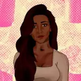
The image above is the current state, with a color scheme applied, and best represents the current progress of the character page redesign. I'd like some feedback so I know I'm going in the right direction.
If you want to redline or provide pointers on design, please do.
Color swatches???
The color swatch feature will be moved under the profile sections and above the gallery, in a new section called "Reference", which is just that: The actual reference sheet. This widget will feature your main reference sheets, and a vertical list of color swatches with more helpful information about each color, including click-to-copy hexadecimal codes, Hex/RGB/HSL mode, and...
Wait for it...
Eyedropper source from your reference artwork. It's going to be a bit to build, but hovering over a color will optionally show a marker on the artwork at the place the color was sampled from. The "Ghost" of the markers will be visible on hover, so if you (an artist), want to copy a certain color, you need only click the marker in the image and it's on your clipboard.
TL;DR I just want reference.
I love characters with wonderfully rich backstories! I also don't want artists to fish through the entire profile to get to the reference section. On the "Page Sections" menu on the left, a switch will be added to toggle "Show All" mode. This is, of course, on by default.
If you turn off "Show All", you can use the Table of Contents to switch which section you're looking at. This will be reflected in the URL, so you should be able to copy/paste that link and anyone will see what you're seeing.
A new character setting will be added for Default View, which can be set to All, Profile, Reference, or Gallery. This view will be used with your shortcodes, and the default setting will be "Reference" if you have one, "Gallery" otherwise. If your gallery is empty, it will show "All".
With this change, all the information an artist needs to visually reference your character will be immediately shown as soon as you send them your ref.st/ shortcode, making it super easy to get going on your commission!
NSFW Image Handling / Gallery Changes
It's been a strong debate, but we've decided that completely hiding NSFW content from the gallery is very confusing. The order of your images can display different if NSFW images are filtered out, and there is no visual cue that there is additional content on the gallery.
In future, NSFW content will have a placeholder in the gallery, but will not display the image unless the user opts in to NSFW content. Clicking an NSFW placeholder will prompt the user to opt-in. We will attempt to design these placeholders to be unobtrusive.
You can also opt to have NSFW images in their own tab, as the new gallery system is tab-based. This will automatically create a system tab for NSFW images, which is public.
In addition to the NSFW system tab, there will now be "Hidden" and "Scraps". "Scraps" is a public system tab which can be used to store rough sketches and reference art (say, a picture of a neat necklace you'd like drawn). "Hidden" is a private system tab which will contain all your Hidden images.
You can also create as many personal tabs as you would like, which you can use to sort your images. We're contemplating adding a folder system, which some people have requested, but one step at a time.
Color Schemes?
The current notable change on color schemes is that they no longer apply to system elements. Some reports have come in that color schemes have made it hard to use the feedback widget or site navigation, so we're going to scope the color scheme to the character profile, but leave the system elements to their default.
Technically speaking, we've completely redone how our color scheme system works, too, and are using a much more robust implementation. (Read: No longer jamming a <style/> tag with !important overrides for everything.) This will allow us to style almost anything on the site using the provided theme, which leads us to...
User color schemes! (Coming not so soon.) User color schemes can be applied site-wide for you, the viewer. They will show up on your User page to other people, and change how the site works as a whole. This is a very distant goal, but I figured I'd mention it while we're here.
Anyway, thanks for reading, and thank you all for your support! I do hope you're as excited for these changes as we are!
The One Who Posts The Things,
Yue
Enro
2018-06-15 17:17:58 +0000 UTCMau Abata
2018-04-03 07:15:44 +0000 UTCMau Abata
2018-04-03 07:11:44 +0000 UTCFuria and Mimma
2018-03-31 07:45:24 +0000 UTCzermit
2018-03-31 02:09:48 +0000 UTCzermit
2018-03-31 02:08:01 +0000 UTC