Hey everyone, here are some thoughts and practical advice behind my latest practices. Let's dive in:
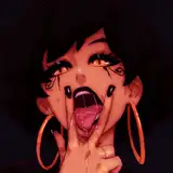
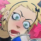
Shocking eyes - Simple tip on sharp looking
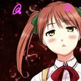
In principle I chose a reference with the same model, beautiful eyes and no expressions, just because I liked the shape of the eyes, but then I felt like I was not pushing myself enough so I targeted a more ambitious goal, a series of random eyes in which each had different expressions, screaming, shocked, smiling and in doubt (you will find the original references in Raindrop). I thought by providing such a contrast the practice would be more interesting and challenging. A very simple tip to get that shocking look in the eyes is to not let the pupil touch any of the corners of the eye; the smaller the pupil and the farther from any corner, the more penetrating the look will be.

.
Mountain of water - Keep it simple but not too simple
This landscape felt nice, although it's terrifying to find oneself in front of such a great wave. I like the composition of the picture, a man on top of the wave, just relaxed, waiting for his moment. I could picture the step-by-step execution of such a picture; that combined with the contrast of fear and calm, make it interesting enough to try, at least for me. When trying gradients on Photoshop or any other software, I recommend you to add a little texture so it does not feel too lazy. Sometimes it's nice to have those small smooth surfaces while rendering, but when the space is too big, it's good to slightly add texture, but unnoticeable at first sight. I did this with the brush cater, Soft Round 394 1 and Sampled Brush 19 10.

.
Who bit the soup - The realistic look
I hesitated about doing this one due to its simplicity, but I thought it was funny. I must confess it took more than I thought, mostly because I did not know how to get that shadow right at the top; it felt too realistic to make such a detailed render and I wanted this to look like a prop from animation. I ended up removing that one and balancing with a bit of texture. The key to realism in my experience is the level of detail your shape has through either lines or values; if you want a more realistic look, pay attention to these two.

.
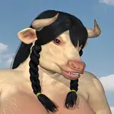
Four brothers - Trick for dark base tone
I loved this reference since it was funny to look at, complex to some degree in terms of shape silhouette, and I felt I could push a bit further things like the expressions on each baby crocodile. Besides, having a hand in the composition always is challenging but a feast for the eye. I struggled a bit with the color values within the little guys, as they were a bit too dark, making its shape, which is already complex, more difficult to read.
The trick is this: while creating, keep values bright and colors desaturated, so they don't become a distraction. After you can adjust and make them darker, but in principle, add those as a guidance. Keep them in different layers and after you define the shadow shape, then specifically select those tones in the shadow layer and make them dark; that's one way of keeping the dark tones bright where the light is and dark where the shadow is.

.
Escape window - Splitting branches for effectiveness
I don't like front views, and this window was flat, but the contrast between colors was so beautiful that I decided to try. The process was very straightforward. A tip I like to give when rendering branches is to split them between branches that have a similar size or branches that are split by distance; these two often go hand in hand but is not always the case. The branches closer to the viewer tend to be bigger and darker, and the farther they are, the smaller and less dark they are due to depth. Making branches are difficult in my experience (not too much experience), since I like to make them one by one, and they don't tend to repeat a pattern so simply, so if you have them all together, with different depth and different size it will be a headache. Try to order them this way, even if you have a brush that makes the branches well enough.

.
Bag of textures - The struggle for simplification
It is always nice to have a simple subject yet complex to some degree; this bag really was annoying for a while, mostly because of the shadow. There were many different tones within the shadow that, combined with the amount of shapes the shadow silhouette had, it did not look good enough once I tried to solve this with one tone. I've decided to move forward with a "good enough" shadow shape, after several attempts, and slowly added more levels of values, like a slight highlight, some very dark values at the top, and then more and more variations of brown. I was not aiming for a realistic look to be honest, but I did not find a better way to convince me to stop trying but by making it interesting through value variations. This ended up turning into a bag of values and textures, with some odd colors. I did not feel satisfied at the end but not disappointed; the job was done and that's good enough! The lesson to learn is, just keep trying, eventually you will figure it out.

Practice 62/63 Process Video: https://youtu.be/cjiFzOXpOYE
Brushes: https://drive.google.com/drive/folders/1wHu8wuEHjDk-VfnZqv8iy8rwnvu8Ngmj?usp=sharing
Pre-order my book Life in Every Sketch on the 3DTotal shop: https://rebrand.ly/The-Art-of-RamonN90

Please let me know if you have any questions!