Today's topic is about how you can create some effects I use in the final steps of my process. The good news is it does not require you to know how to paint or draw; anyone can try! You only need a program like Photoshop. If you don't have Photoshop, don't worry; most of these filters and effects can be found by simply knowing the name of the effect and what it is supposed to do. Let's dive in.
Levels
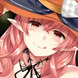
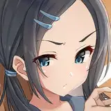
Once I finish my artworks, sometimes I adjust the values using levels to make dark tones a bit darker and bright ones a bit brighter. The contrast between values makes the shapes way more distinctive and sharp. The way I do this is by moving the triangular icons in the corners closer to the center. This adjustment is subtle, as it tends to change the saturation of the colors as well, so be careful not to push too much toward the center.

.
Selective Colors
I use selective color to adjust blacks a little toward cyan and to adjust and saturate one or two colors from the artwork. This is because moving the dark tones toward one color blends the shadows into a distinctive palette; the mood created is a bit cold, just a personal taste. As for other color adjustments, it depends on the subject, but often I saturate either the shadow or the bright side of the skin and any other color as an extra. In this practice, I will probably adjust the blue of the sweater, but since I quite like the result after this filter, I did not feel compelled to change it.

.
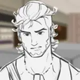
Smart Sharpen
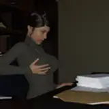
This simple filter creates a slight black and white contour around every contrasted shape. The amount and radius I use is 400% x 4.0%, as you can see in the picture below, but it is directly tied to the canvas size. I am using a big size, so the effect is not that radical, but if you plan to use a smaller size, reduce both percentages so it does not look way too distracting.

.
Chromatic Aberration
And finally, the last touch I like because it looks kind of cinematic is chromatic aberration. I simply duplicate the final layer twice. For the first copy layer, I double-click on top, and the "layer style" window pops up; in there, I turn off the "R" channel, hit OK, and move that layer a little to the right. Then with the second copy layer, I double-click on top, and the "layer style" window pops up; in there, I turn off the "G" channel, hit OK, and move that layer a little to the left. Finally, I erase from both layers the spot I want to remain sharp in my artwork, like the focal point, and leave the rest as it is. This is because this effect tends to blur the overall look of the piece, so the erase keeps at least one spot sharp.

I hope these effects boost that style of yours!
.
Remember you can now pre-order my book Life in Every Sketch on the 3DTotal shop.
https://rebrand.ly/The-Art-of-RamonN90

Please let me know if you have any questions, I’ll be happy to help with art advice or book details.
Ramon Nuñez
2025-08-28 07:54:40 +0000 UTCRamon Nuñez
2025-08-28 07:54:33 +0000 UTCLandon Nuzum-Clark
2025-08-27 15:04:13 +0000 UTCDEATH666VALLEY
2025-08-26 12:03:52 +0000 UTC