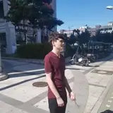
PG 297 WIPs
Added 2023-12-08 20:00:06 +0000 UTCSome work-in-progress shots of the third panel on page 297. I was pretty happy how the panel turned out over all and I wanted to share it without the text!

[You may wonder— why bother with a full background when I know text bubbles are going to cover it? It’s pretty straightforward, really— if I wanted to change text (or if it was localized into another language) the bubble size can be flexible without much effort later.]
Here’s the line art/flats and starting to build out the background. After I get down flat colors, I work from the background forward. If you’re trying to build depth, it’s good to remember that the further away something is, the more it fades into to the sky. (I’ve said it before but I think it’s just a great bit of advice.)

I like these ‘one off’ panels where I get to illustrate some other place and color scene. I try to pick something complimentary to the other panels of the surrounding scene. This one, I wasn’t really sure what I wanted to do, so I played with a palette tool until I got somewhere to jump off from. [Anyway, paletton.com is a good site if you want to play with colors schemes.]


Comments
Creating atmospheric perspective is pretty simple, especially digitally. Everything fades into the sky color the further away it is (a classic example is a mountain range in fog). The closest elements have the most color diversity-- ie, the closer the viewer, the more detail. As things get further away, you add less color diversity, less detail, and add a semi-opaque layer of the sky color over it. Maybe you start at only 30% of 'sky color' opacity as something is in the near-distance, then gradually increase the opacity for each 'band' of distance. It pushes those 'bands' away from the viewer and toward the sky, creating depth. If you don't use layers in your digital workflow, you can eyedrop your sky color and use an opacity sensitive brush to paint over parts of your image, and push elements back that way. I tend to do that on individual layers if I want a lighter touch/maintain detail (like the middle-ground trees in this one.) Anyway, I hope that makes sense! Next time you're out and about outside and have long sightlines, pay special attention to the horizon and how things fade into it. It really helps conceptualizing it 'on paper,' once you start paying attention to the real thing.
Teagan Gavet
2023-12-09 01:39:03 +0000 UTCIt's neat to see Scree's pack have similar colors. They probably were all brothers and sisters or hopefully related individuals. She lost her family. Maybe she had a mate too.
Kairo
2023-12-08 23:14:12 +0000 UTCI love seeing insights like this! The way you blend characters into a scene is so impressive. I'd love to hear more about your method of creating that atmospheric perspective
Hail - DOW Comic
2023-12-08 20:31:50 +0000 UTC