A follow up on the last renders
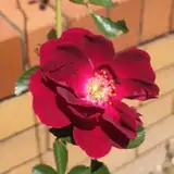
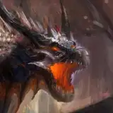
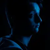
Added 2024-03-03 15:59:38 +0000 UTCSo there's something that's been bothering me a little with the last set of images. I'm not too sure how long this has been going on for but it became quite noticeable in the Bracken renders. For some reason or another it seems the color space is being mistranslated along the way, but only with certain viewing methods. This basically makes my renders look a little flatter and washed out than they should. A good example of what I mean is this here:
The left image is the art viewed in windows photos and the right is the actual colors viewed inside of davinci resolve. (Viewing the image in DJV shows the correct colors.)

Now I know I am a bit of a perfectionist when it comes to my art related endeavors however I wanted to know from you all if this is an issue that I should spend some time trying to fix or if its really not that big of a deal to the overall quality ^^
Comments
i prefer the right image. for me , the contrast between light and shadow is better for me.
Jean luc
2024-06-25 06:43:28 +0000 UTCits negligible
Tunnel Time
2024-03-04 13:27:15 +0000 UTCI do see the difference but I dont think its anything to worry over.
Fatal Fox
2024-03-04 05:44:33 +0000 UTC