This one isn't anything too complicated, but I haven't done one of these in a while, so I thought it'd be fun!
If you have questions along the way (about brushes, my coloring methods, etc), you might be able to find answers by clicking through the drawing guide masterpost. If you still aren't sure about something, though, feel free to leave a comment at the end!
So to start:
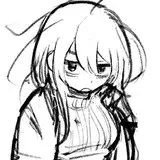
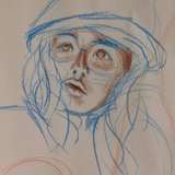
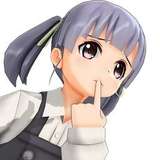
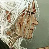
1) The initial sketch, drawn in Paint Tool Sai using the airbrush. At first I liked the idea of her in a prayer pose.
2) But then I liked the idea of her posing with a cut apple in a heart, kind of referencing her loss of life span. That's about where my thoughts on this composition end - ultimately, this image is just a straightforward, nothing-too-complicated portrait that I did for fun.
3) After asking some friends which sketch they liked best, the general consensus was "the expression of the first one is better, but the pose of the second one is better," so I combined the two.
4) The cleaner sketch!
5) And then the lineart! Not a lot to report here, since I followed the sketch pretty closely. Flipping between the two, I can't help but feel like the sketch expression had something that the lineart lost, but I decided I'd just try to figure it out in the color phase.
6) The first pass at colors, which I actually ended up liking! I wanted this one to feel very red over all, but I also wanted her eyes, lipstick, and the apple to stand out, so I colored the background eyes a slightly duller pink.
7) Before moving on to anything else, I colored the lines. Coloring the lines usually gives a sense of dimension on its own, so doing it first lets me assess how much I want to render everything. (I also realized I forgot her eyebrows, so I added them here.)
8) I realized that the lines felt a little lacking, so I used Clip Studio's "correct line width" to thicken them up a bit. It's amazing what a difference it makes!
9) Now I start rendering! I used a mixture of the default G pen and the tone scraping brush. For the shadows of her hair, I mixed some pink in. I also added some blush to various parts of her skin and really focused on the details in her eyes, since that's ultimately where I want the viewer's attention to go.
10) I felt like she wasn't standing out enough, so I added a highlight to the top of her hair. I added some blush to her shoulders, too.
11) She still felt a little dull, so I decided to push the contrast a little more. I darkened her outfit, and instead of leaving her eyes totally off white, I used pure white for some of the shine. I also made her hair highlights a brighter yellow.
At this point, I also wanted her to stand out from the background a little more, so I duplicated the lineart layer, pulled it below the color layers, and used the "correct line width" filter to make them thicker. This way only the very edges were thickened, since the rest of the lines are covered by color.
I also added a little detail to the lace. To do this I just made a new layer and drew it in using her skin tone - I didn't draw any new lineart.
12) At this point, most edits are pretty minor. I pushed the highlights and shadows a bit more, and I added highlights to her hands to help draw your eye toward them. I also re-colored the lines of the eyes in the background.
13) One final thing - I added a correction layer and adjust the saturation to make the colors pop just a little more, and a noise layer (set to overlay) to add a little grain.
14-16) A better look at the colored lineart, plus a closer look at some details (50% zoom)
And that's it! Nothing super exciting this time around, but I thought it'd be fun to see the process regardless. Let me know if you have any questions!