Before diving into this, here's a reminder that all past process posts and guides can be found using this masterlist. If you find yourself stuck wondering how I performed some particular task, try looking through it! It covers things like my coloring techniques, lineart techniques, how I approach dress folds, etc.
Okay, let's get started!
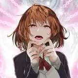
1) The initial idea, which was scribbled down just so I wouldn't forget. I wanted to convey the intensity of total infatuation and the way it fills your mind so quickly that it feels like it's about to come spilling out. I also wanted it to be a nod to GL manga, which I read a lot as a teen, so I went with a familiar dynamic - the cute shy girl who has a crush on the cool sporty girl.
2) A very slightly more focused thumbnail with a pose change. I didn't want to cover up too much of her face since she's already losing half of it in this image!
3) The sketch. I used my phone's selfie camera to help me figure out the angles and the exact hand positioning (I should probably get a desk mirror).
4) I lower the opacity of the sketch layer and draw the lineart on a new layer, using the sketch as a guide. The face cutaway still felt a little too rough and I couldn't quite grasp the poses, though, so I made a third layer and drew a cleaner sketch for that section.
5) I lined the cutaway segment on yet another layer, since this will make it easier for me to color the lines and apply effects to this section separately if I need to.
6) My initial color plan was pretty tame. Nothing too out of the ordinary, but I worried that there wasn't enough contrast to make the cutaway pop.
7) Something weirder, more limited, and warmer. I liked the redness of the cutaway - I felt like it reflected the intensity of romantic feelings. It had its downsides, though: the background color is bright enough that it takes the focus away from the actual figure, plus the cutaway being so pink and red makes it feel almost kind of gorey at first glance lol...
8) Another limited palette, sort of reversed from the previous one. At this point I'd been staring at these for so long that I couldn't tell which one I liked best, but the person I asked for feedback immediately singled this one out because it's more immediately readable than the other two. I was pretty hesitant, because I thought it was weird for the cutaway to be yellow and I thought the grey was a little dull, but I had to stop staring at these, so I went full steam ahead. (In the end I think they were totally correct)
As a side note, the main figure and the colors within the cutaway are on separate layers to make it easier to work with these sections individually.
9) I wasn't totally sure just how flat I wanted this to be, so I locked the line opacity and colored them first so I could re-evaluate. I used a very short range of colors for this one:

10) I wanted to bring some of the yellow out into the rest of the image, so I locked the color layer for the figure and used Clip Studio's "tone scraping" airbrush to add a bit of a highlight. I also used this same tool to add a pink blush to her face, ears, and fingertips to emphasize her flustered emotions. I wanted her to look sort of overheated.
I also realized some people might read her lash line as her eyebrow, so I shifted it downward and made her actual eyebrow a little more prominent to combat that.
11) Very little actually happens here, but it looks significant! I recolored the shirt to be slightly darker and then added very, very subtle highlights using a slightly lighter color and the G pen. I also added two very subtle light tones to the skirt.

I also cleaned up the background hearts and added some more elongated ones, which helped fill the space and make them feel like they're rushing out / can't be contained. Most importantly, though, I did a little line thickening in two parts.
The first line thickening was easy. I duplicated the two lineart layers (just so I would still have the originals if I decided I liked them better), and on the two duplicated layers I selected the Clip Studio filter "correct line width" to make them a little bolder over all.
However, I wanted the outermost line to be even bolder. I duplicate the figure's layer a second time, then take this second copy and slide it beneath the color layer. I then use "correct line width" again to make it extra bold, but since everything is under the color layer, the only parts that are visible are the parts that bleed outward from beneath the colors, so you wind up with a really thick outer line!
12) The final touches! A few things are happening here. The first change is really simple. Some of the colors felt a little dull, so I went to "new corrective layer" and made a saturation layer. I saturated things just a little so that it feels brighter and more candy-like.
Secondly, I did my usual "duplicate the lineart layer, color it red, slip it under the other lines and shift it." I talk more about this in my lineart guide, which you can find in the masterpost mentioned at the top of this post.
The third one: I decide I want the hearts to have a little more texture. I did this a little strangely. (I also duplicated the heart layer, colored it yellow, shifted it beneath the original heart layer, and shifted it so it's offset. I just wanted to mention that before getting into this weirder bit!)

1) The first image is from before I did anything.
2) I locked the opacity of the pink hearts and used tone scraping to add some flecks of darker pink.
3) I then dragged and dropped a Clip Studio halftone asset that I'd pre-created using this guide, and then merged it with a new blank layer to rasterize it (so it isn't an "object layer" anymore).
4) I turned off the halftone layer just to make it easier to see what's going on here, but you don't have to. For this part I held CTRL and left clicked the layer preview for my hearts layer. This creates a selection for all active pixels on that layer.
5) With the selection still active, I selected my halftone layer and clicked CTRL+C, then CTRL+P (which created a new layer). This copy and pastes only the parts within the selection. Once I deleted the halftone layer, it left me with these nice little halftone heart cutouts!
6) I locked the opacity of the halftone cutouts and colored them yellow.
And that's it! If you have any additional questions, feel free to ask! (And don't forget there are some 50% zoom screencaps in the above gallery that will help you get a better look at things!)