This is a page from The Sprite and the Gardener that people seemed to like, so I want to talk about it a little bit! Since this was drawn a while back I don't have a ton of specific process notes, so this will be a little more about my thoughts along the way.
1) The thumbnail, which is obviously very rough, but honestly ended up being pretty close to the end result! The only things that I knew I really wanted were a) to have their expressions somewhat call back to the original concept page, and 2) to arrange the panels in a way that felt like a burst of light. I feel like this was more pronounced in the thumbnail. I was taking inspiration from a lot of places during this time, but I feel like this was most inspired by splatbones, whose panel layouts are so spontaneous and illustrative. I've never seen anyone else convey emotions through panels so organically.
2) The first of what ultimately ended up being three different sketches - this page was important, so I wanted to make sure I got it right. This sketch helped me figure out the general placement of things a little better.
3) The second sketch, which helped me solidify the lines and explore the expressions more concretely. I had initially meant for this to be the final sketch.
4) But obviously it wasn't! So here's the third sketch, where I made a few tweaks to push the expressions and over all atmosphere more. I also removed Elena's hat, since I felt that it obscured too much and dampened the effect. I also changed her shirt (I don't remember why.) Most importantly, I extended the edges of the panels to make the image reach the very edges of the page - I felt like the way they were cut off made it too boxed in. I wanted it to feel unrestrained.
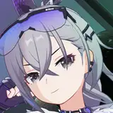
5) The lineart which, as usual, was done in Paint Tool Sai. It follows the sketch pretty closely, though I did make Wisteria's eyes a little more reflective. (For a closer look into my lineart process, you can refer back to this post!)
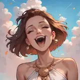
6) Testing out a color rough. Rather than sticking to on-model colors, I wanted this one to convey a feeling. When dealing with stuff like crushes, pink is an obvious go-to, but I also needed it to feel like morning light, so I ended up leaning into bright, somewhat pastel pinks and yellows. (This ended up being a trend throughout the book)
7) I flatted everything on a new layer. I also changed the color of the window in the leaves that Wisteria's looking through at the bottom. Using the same color as Elena's background made the scene a little more clear. (For more info regarding how I color, you can refer back to this post!)
8) Some minor refinement - adding a ring of yellow around Elena's figure to make the image feel more like it's full of light, plus adding blush to Wisteria's face using Clip Studio's tone scraping brush.
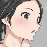
9) To brighten up the image further, I color the lineart pretty lightly, using a lot of reds and desaturated purples. Looking back, I wish I'd colored the panel lines, too...
10) Coloring the lines ended up making the linework a little underwhelming, though, so I had to give them a little more weight. I duplicated the layer and then shifted it down and to the left by a pixel before merging them together. This way, they still feel delicate, but they're robust enough that they stand out a bit better.
As always, thank you to everyone who has picked up this book!!