This is one of the more complex things I've drawn in the past year, but also one of the most rewarding! It felt like putting a big puzzle together, so I wanted to talk about my thoughts throughout the process.
1) The thumbnail sketch, drawn on an iPad 9.7 using Procreate. I'd been wanting to draw a Higurashi image for a long time, but I could never decide what part of the series I wanted to focus on, so I just... decided to focus on the whole thing instead! The thing I always liked most about Higurashi is the way its story loops back into itself over and over, with events overlapping in ways that both reveal answers and raise new questions, so I wanted to try conveying that idea somehow! I tried creating a composition that would lead your eyes around in a repeated cycle, with figures overlapping each other in ways that suggest specific scenes and relationships.
2) The sketch, drawn using Paint Tool SAI's airbrush. I don't have much to add here except that it was really a struggle to arrange lol...
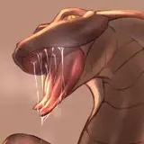
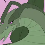
3) The lineart, drawn using Paint Tool SAI's brush tool (Spread: 82, Noise: 38). It's worth nothing that I drew Rika on her own layer, since I wanted to be able to work with her separately.
4) The flats, which were done using Clip Studio's "Refer other layers" fill tool with "Close gap" turned on. Trying to get the right mood for this image was difficult, and I had to resort to using overlay layers to help tie the colors together. Rika has her own color layer, and at this point I've decided that I want her to utilize a cooler color scheme in comparison to the warm red of the rest of the image. I wanted her to seem like she's simultaneously being engulfed by but also detached from the rest of the image.
5) This is where I start just going at it. I color over some of the sections that overlap in order to connect different subjects visually, but also to connect them in ways that suggest series events. At this point, I'm just using the Clip Studio G pen with Anti-alias turned off. For a more in-depth look at how I color, I've written a standalone post here!
6) I lock the lineart layer and start coloring lines, both to soften parts of the image and to give a sense of translucency to certain areas. While most of the lines are warm pinks and reds, I use cooler lines on Rika, Hanyuu, and the cicada cycle - even though these subjects are fully integrated into the image, their colors help set them apart. I wanted them to feel like an outer force working from within, if that makes sense.
7) Further coloring of the lines and general cleanup. The left side of the image felt too enclosed, so I darkened the crows to help balance out the dark spaces that appear throughout the image. I also completely gave up on trying to incorporate the syringe overlap on Keiichi that was present in the sketch - there was no way to avoid making it look cheesy! I really tried!
8) Final touches! I thickened a few lines using Clip Studio's Filter -> Correct drawing line -> Correct line width. You might also notice that there's a peek of red beneath the lineart layers (it's more visible in the closeups) - to do this, I duplicated the lineart, colored the lower lineart layer red with opacity locked, and then shifted it down and to the right by a pixel or two.
I also applied a noise filter to the image. The way I usually do this is by opening the image in Photoshop, flattening the entire thing, applying the noise filter, copying the flattened/filtered version, unflattening the layers, and then pasting what I copied on top. (I know this sounds like total nonsense. If anyone wants me to elaborate, I can take some screenshots or something!) From there, I set this layer to overlay and mess with the opacity until I like it. For this, since I had Rika on a separate layer, I was able to exclude her.
12-13) Compositionally, it was really hard to figure out how to arrange this without it just feeling cluttered. To help with that, I tried to arrange things in a way that formed a sort of cycle for your eyes to follow. It's a little abstract, but I think it works well enough! The dark negative space throughout the image also helps the foreground pop and gives the image a little breathing room.
And that's it! As usual, please feel free to let me know if you want any further clarification on anything!