With this image, I wasn't *super* thorough with documenting each stage as I worked on it, but I'd like to discuss it either way! After the initial process images, there are a few closeups and additional notes at the end of the gallery.
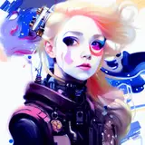
1) The thumbnail sketch, drawn on an iPad 9.7 using Procreate. My main goal with this was to encompass the final arc of the series - Madoka's ascension as a god-like figure, the way that she breaks away from the cycle of despair and leads the way out, and Homura's reluctance to accept it. To accomplish this, I did a few things: I used Madoka's grief seed as the core motif (and in the thumbnail, I actually intended it to be physically present as a sort of cage), and I borrowed imagery from classic depictions of the ascension of Christ - specifically, the Christ figure rising into the clouds as the disciples look on.
2) The sketch, drawn using Paint Tool SAI's airbrush. At this point, I'd already abandoned the physical grief seed for something more subtle.
3) The lineart, drawn using Paint Tool SAI's brush tool (Spread: 82, Noise: 38). For more information regarding my lineart process, I have a more in depth post here! Something that might also be helpful is my guide to drawing dress ruffles.
4) This is where my steps got a little messy, and where I didn't document things very well! (But I also have a standalone post that discusses my coloring techniques, too, if you're interested in hearing more about it.)
Using Clip Studio's bucket tool, I flatted each plane on four separate layers - the background on one, the flash of light on another, the Kyuubeys on a third, and the figures on a fourth. From there, I locked each layer's opacity and roughly tried to decide what I wanted to do with the clouds and Kyuubeys. I also tried coloring the lines a bit - in general, I was just trying to get a feel for the direction I wanted to take without putting in too much effort to do so cleanly. Once I more or less felt good about it, I moved on.
5) ... but obviously I wasn't *that* pleased with it, since I ended up changing things! The image felt too dull, and didn't have any of the radiance I wanted. I got rid of the lineart on the burst of light, making the space around Madoka feel much more open, and I brightened up pretty much everything else, particularly the lines. Initially, I had intentionally made the Kyuubeys a bit dull to set them apart, but in the end I liked it better when they were more similar in color to the clouds, making it less obvious where one ends and the other begins.
To shade the clothing, I actually only add two or so very subtle lighter shades for highlights - without any actual shadows, the image feels much more full of light. (You can see this better in the closeup images - sometimes they're *very* subtle!)
I also don't usually paint things, but in this case, I needed the clouds to be soft, so I used an airbrush tool and tone scraping. To match the rest of the image, I made them yellow at their core, and then shaded them with pink - I relied heavily on the eyedropper tool to grab the shades inbetween to help smooth things out.
6-13) Additional notes: Compositionally, Madoka and Homura are the stars here, so I built the image with them at the center and had everything else lead directly to them (and then, once you make it to them, you're either carried back to the others, or Madoka's gaze carries you upward.) I also don't typically worry too much about checking my images in grayscale, but in this case, I did make sure to have both the lightest and darkest colors in the image within the focal point - that contrast helps grab your attention.
And that's pretty much it! I really enjoyed working on this one - parts of it feel pretty different from my usual stuff, but I learned a lot. As always, if you have any other questions, please feel free to ask and I'll do my best to explain!