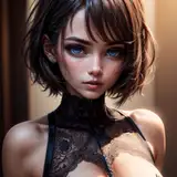
I want to talk a bit about the making-of process for this image! The first section will cover the image itself in stages, while the final portion will have additional notes regarding composition, reference, brushes, and finishing touches.
1) The thumbnail sketch, drawn on an iPad 9.7 using Procreate. I wanted to create a drawing that was cozy and entangling, that reflected the beginning of spring, and that complimented Wisteria's hair - white clover checked all the boxes! After getting the thumbnail down, I went out and took a few reference photos.
2) The refined sketch, drawn using Paint Tool SAI's airbrush. I deliberately arranged the stems in a way that would help guide the viewer's eye around and up to the hair, blossoms, and ultimately the open space, helping a compact image that could easily feel heavy feel lively and buoyant instead.
3) Once I feel that the sketch is clean enough that I won't have to do a ton of guesswork, I start inking! I try to keep my pace up here, because if I fuss too much, it can start feel lifeless. Actually, if you've ever noticed that my art has a lot of line breaks, it's because I've found that it's faster if, any time I need to stop my stylus, I skip ahead a little. This way I don't have to worry about making sure the next portion of the line matches up perfectly.
4) Flats! At this point I swap to Clip Studio, which has an incredible fill bucket tool that helps avoid flooding. The color does still peek out of the gaps a bit, though, and I have to fix this manually (I use the G-pen with "Anti-alias" set to none - this makes it easy to change the color later with the fill bucket without getting that white "halo") For a more in depth look at how I color, I put together a standalone post here!
5) This is where it starts coming together! By locking the opacity of the lineart layer, I'm able to color it without altering the lines. I use red on things that I want to recede more / be more delicate, while I use darker red / black when I want lines to stand out more. This helps bring a sense of dimension.
I've also lightened the background since I felt that it was becoming too heavy, and I added a bit of texture within the hair and flowers. To do this, I used the "Auto select" tool with "Follow adjacent pixel" turned off and color margin set to 0, then clicked the hair or flowers. This will select *only* that exact color anywhere it appears on your selected layer! (This is why I used an aliased brush to color!) From there, I used a brush called "Tone scraping" to lightly spray in a color that was a few shades lighter
6) Here's where the final touches come in! You might notice that the quality of the lines looks different. Recently, I'm into slightly thicker lines, but I can't seem to break away from having a light touch. So from the bar at the top of Clip Studio, I click "Filter," then "Correct drawing line," then "Correct line width." This lets you either thicken or thin your lines! (But I recommend doing this on a duplicate layer, since thinning a line after thickening can cause it to degrade.)
7-10) Final notes, additional information, etc: The composition can be read any number of ways, but I wanted to make sure that it always kept your eyes moving - you could potentially follow the stems, which were deliberately arranged to carry your eye both around the figure and toward the white blossoms, while leaves of clover help frame her face. More naturally, though, your eye will probably bounce around the pops of white located throughout the image - the flowers, the hair, the dress, and most importantly, the highlights of her eyes.
And that's it! I realize that things got a little wordy, so if you have any questions about specifics, please feel free to ask!


![Someday*[サムデイ]](https://saketami.com/istorage/107168.jpg)