Help us design the 2023 Kickstarter pin!
Added 2023-02-24 17:32:28 +0000 UTCHello, Traxians! Our Kickstarter campaign for this year's live show is in full swing. Not only that, but we set a new record when it comes to how quickly we got 100% funded. We're still kind of in shock, to be honest, but we're not all that much surprised - the RiffTrax community of fans is an incredible bunch, and we're chuffed to have such amazing support. So, if you're a backer, thank you! And if not, don't worry - you still have another 36 days to become one.
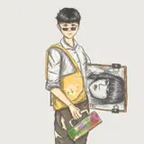
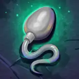
In the meantime, we need the help of our Traxians once again! We have a handful of great options provided to us by the pin designer, Nikol King, for the design of the exclusive pin reward (which will also be available to purchase separately through BackerKit after the campaign ends) - but we can't decide which one we like the most. That's where you come in!

Choose the one design you like best, and let us know what you like about it in the comments. We'll use this information as a guide for the final design.
We might even have a follow-up poll for "finalists" of this one, if need be, to narrow this down further to one design that backers of the $110 EXCLUSIVE PIN tier will receive - so let us know what you think!
Comments
Am I the only one seeing the ... pink triangles ... and ... having very bad associations with them? I wouldn't be able to vote for any pink triangle design because of the very dark historical events with which they're associated. So even though I like #5 in every other way - I like having the movie name and Rifftrax both on there - so anyway. I voted #1.
Jessica Tomechak
2023-03-02 05:28:03 +0000 UTCI voted for #5 as well.
Oliver Langland
2023-03-01 12:44:34 +0000 UTCI like #5, It's a well balanced design that includes RAD, RiffTrax and the bike. I like the color scheme too.
Thomas Noel
2023-03-01 00:35:20 +0000 UTCI went with #4 because it's not an equilateral triangle, and so more dynamic. #s 1 and 2 were close second choices. Whatever design we go with, it really needs the pink to set it in the 80's; otherwise it just looks like a pin for a more modern desert biking event.
Jennifer Bowyer
2023-03-01 00:05:35 +0000 UTCI went with #4 because it seemed the most dynamic, and included both "RAD" and "RIFFTRAX". I'm looking forward to this, because I don't think I ever actually got to watch RAD as a kid - there was a trailer for it on my VHS copy of The Dirt Bike Kid, which I watched a TON of times, but I never got the other big BMX-related 80s kids movie!
Brian Sebby
2023-02-28 02:08:05 +0000 UTCI'm a designer and love all of these, but No. 1 is the strongest and most engaging. The gradient color background makes the Rifftrax lettering pop and the bmx rider strikes a more interesting pose, creating a well-balanced layout
Zach De La Cruz
2023-02-27 16:43:01 +0000 UTCI went with No. 1 because I like "RIFFTRAX" being so large -- though I wouldn't mind the "RAD" movie name also being included (but smaller) -- and because I like the way the guy's wrestling the monstrous, sentient bike for his life. ...Or am I missing something?
James Geier
2023-02-27 03:43:45 +0000 UTCIs there a deadline to this? Just out of curiosity.
Justin Wingate
2023-02-26 12:22:51 +0000 UTCI like 5 best. 2 seems a little dark. It looks better when the word Rad is sticking off the top. I like 1 except that it doesn’t say Rad, and one might wonder what the bike and rider have to do with RiffTrax.
Wendy Burke
2023-02-26 07:33:33 +0000 UTCI went with number 2. I did not like 1 and 3 because they do not have the name of the movie and number 4 is out because, as others have mentioned, it looks rather frail. In the end, I went with 2 because “RiffTrax” was bigger.
William Hussar
2023-02-25 23:36:41 +0000 UTC#2 says it all!
Karl Hamann
2023-02-25 21:30:32 +0000 UTC