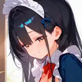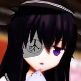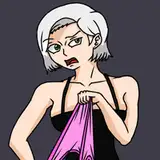
Yet another art poll!
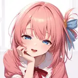
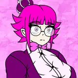
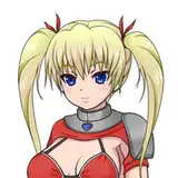
Added 2024-02-23 09:08:28 +0000 UTCThe art should be in a post above this again, so that I could post the full resolution.
Two things to note before you provide feedback. The triangular shape of the eye was my idea, as I found a reference image with something similar that I really liked. I personally do like how it turned out, but it's definitely a bit unusual for an eye shape. If you think the eye is drawn well, but you don't like the triangular shape, I'd prefer you don't dock points with your score and instead let me know in the comments, because I'm sure we can use a more standard eye shape in the future.
Additionally, the bottom part of the back of the hair is probably going to be changed, because the head should be attached to a body at some point, which will change how the hair lies.
As before, please do leave more detailed feedback in the comments, if you have any to give. Thanks!
Comments
This particular image is just drawn from a side view angle, as the full scene i plan to draw works best from that angle. It won't always be done from this angle.
StickyIcky
2024-02-27 06:15:49 +0000 UTCEven though we only have a small piece, it's very nice. I agree that the triangle eye is ..... weird? But drawn pretty well. I'm excited to see this continued. EDIT: I thought about it some more; is the direction going to be the sideways, 2D style? If it works, it works. It's just odd to me.
Myriad
2024-02-24 03:51:12 +0000 UTCthe lack of lines on the hair to differentiate different strands/sections makes it look very flat and if you changed the colour of it to grey or some variation of then it would look like part of an over sized fantasy sword blade that would be something called "the butcher's battle cleaver". it's still leagues better than the previous art you posted a poll for. but at the end of the day the "PROBLEM" you are going to face is that the game and all of it's main line art are very high quality for this sort of thing, which sets a high bar in terms of expectations people will have and makes other art look terrible by comparison. Of which comparison between the main line art and this art will be unavoidable because the game and it's main line art are why people are here in the first place
laura smith
2024-02-23 11:24:17 +0000 UTCNaturally, I only thought about how the triangular eye didn't fit in with the rest of the game's art after it was already drawn, at which point I figured I'd just leave it. Probably best to stay away from it in the future. I do want more detail on the hair, especially at the bottom of the back of it. It should probably separate into some strands or something like that. Some of the lack of detail on the hair might be attributed to the hairstyle itself, as I wanted long straight hair with blunt bangs, which are both kind of uniform. We'll have to see what things look like with a different hairstyle. Are there any other details in particular you could think to add? Thanks again for all the feedback, it's really helpful.
StickyIcky
2024-02-23 10:31:53 +0000 UTCthe triangle shape of the eye just doesn't fit with game's main art style, but overall the art style itself is not bad , but considering we only have the one image to go off of I can't give a more conclusive rating than 6.5 out of 10. Is firmly good quality, but lacks higher levels of detail that would raise the score. The only other point I could make is tied to the lack of higher detail and that is if the hair wasn't attached to a head there would a be small amount of people that would wonder what it is mostly because the low detail level causes it to look kind of flat
laura smith
2024-02-23 09:35:45 +0000 UTC