houseofhellishharlots Website Revamp
Added 2024-08-08 17:04:26 +0000 UTCThe houseofhellishharlots.com website has been revamped.
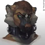
With a full HoHH 1.5 demo out with artwork I thought it was time to update the old website. I've replaced the Wombo AI-generated art with some art from the game. I've also fixed the menu to work on mobile devices, which has been needed for a while!
It's still a work in progress.
The harlot profile page and harlot gallery (of other art) both look okay, I think, although I'd like to add the functionality to click on an image and see a bigger version. Not sure how that's done, so some research required.
I've combined some of the other pages together.
I think the backgrounds (harlot pinup over room background) might be a little too busy for those pages. I might need to either increase the opacity of the text background or simplify them a little.
Mobile is still my personal bugbear. The menu should be fixed and both of the harlot galleries look okay on my test device. I still need to sort out the fonts and backgrounds to improve readability.
Overall, though, I hope it's an improvement.
I'll keep tinkering away on it. All feedback gratefully accepted!
Update 24.08.09
I felt the backgrounds were a little too "busy" on some of the pages, so I simplified them with a similar style to the game.
Comments
No problem at all. I'll try out different fonts. Nosifer was the one I used for the Sandwiched by novellas. Olde English for the short story collections. So I tend to stick with ones I'm familiar with. More upper-class French brothel sounds like a better thing to aim for. I'll do some research to see if I can find something that fits. Handwriting style is a pain. I wanted that for the profiles, but could never find one that looked good and was easy to read.
Many-Eyed Hydra
2024-08-09 11:12:01 +0000 UTCThe new art for the home page is good and over-all the site looks much more developed. I have to confess though I really dislike the drippy Tales from the Crypt style font for the game name—to my eyes it would be better to have some Gothicesque handwriting or easy to read calligraphic style. The current font detracts from the sexy but sinister upper-class French brothel vibe (sorry to be negative on that!).
CrimsonCrown
2024-08-08 20:29:41 +0000 UTC